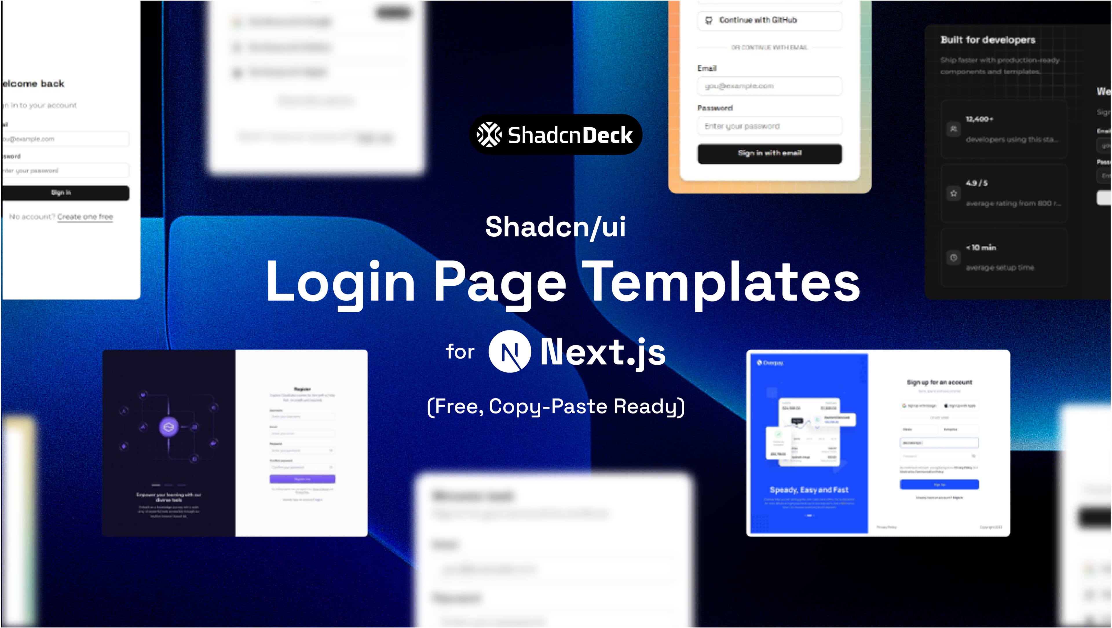
The best shadcn login page templates combine shadcn/ui components, Next.js App Router Server Actions, and Framer Motion into copy-paste ready authentication screens. All 5 variants below are free, adapt to your project's light and dark theme automatically, and are built on the same stack as shadcn/ui's official login blocks, but with opinionated styling, restrained motion, and smart UX patterns the official blocks skip.
Each variant is production ready. Install the dependencies, drop the component into app/login/page.tsx, and wire up your auth provider.
What makes a good shadcn/ui login page template?
A production ready shadcn login page template does four things well. First, it uses shadcn/ui's <Form />, <Input />, and <Button /> primitives, so it inherits accessibility and theming for free. Second, it handles validation with Zod and react-hook-form. Third, it connects to Next.js Server Actions so form submission never touches client-side fetch calls. Fourth, it uses your project's theme tokens (bg-card, text-foreground, border) instead of a hardcoded dark palette, so it looks correct in light and dark mode without extra work.
The official shadcn/ui login blocks at ui.shadcn.com/blocks/login cover the basics well. These 5 variants go further: animated borders, smart "last used" auth detection, magic link flows, and split-screen marketing panels, all with motion that respects prefers-reduced-motion.
Prerequisites: install these once
Before copying any variant, install the required packages. Run this in your Next.js App Router project:
shadcn/ui requires Next.js 14 or later. These variants are tested on Next.js 15 with React 19 and Tailwind CSS v4.
Variant 1: Aurora Border (animated gradient border)
The Aurora Border variant wraps the login card in a traveling comet of light using Magic UI's <BorderBeam /> component: a small gradient segment that runs continuously around the card's edge. It uses the standard shadcn <Card />, <CardHeader />, <CardContent />, and <CardFooter /> composition, so it fits directly into any project that already uses those primitives.
Best for: SaaS products, dev tools, and any product where the login screen is the first visual impression.
Dependencies: framer-motion (or motion), shadcn/ui form, input, button, card, plus Magic UI's border-beam component
Variant 2: Beam Background (animated light sweep)
The Beam Background variant places a clean, elevated card over a full-bleed background: a rotating, multi-color gradient wash built from your theme's chart colors, layered under a dot-grid. It runs fast enough to actually read as motion, not a static blur. Social auth buttons with real Google and GitHub logos sit above the email and password form.
Best for: Consumer SaaS, startup landing pages, products where Google and GitHub auth are the primary paths.
Dependencies: framer-motion, shadcn/ui form, input, button, card
Sign in
Choose your preferred method
Add the loginWithProvider Server Action to app/actions/auth.ts:
Variant 3: Last Used (smart auth detection)
The Last Used variant mirrors Vercel's own login screen: a bold centered title, an email field with its own "Continue with email" button up top, then a list of provider buttons below a divider. It reads the last used auth method from localStorage and surfaces it first, with a small "Last used" badge pinned to the button's corner. Less common providers (SSO, Passkey) collapse behind a "Show other options" link until needed.
Best for: Developer tools, CLI products, and any SaaS with repeat logins, in the style of Vercel, Railway, and Linear.
Dependencies: framer-motion, shadcn/ui form, input, button, badge
The lastUsedProvider key persists across sessions. On first visit, all providers appear in default order. On return visits, the last used method rises to the top automatically.
Building a login screen is only half the battle once you need a full marketing site around it. FoxCopy just launched with a matching shadcn/ui SaaS landing page and a blog baked in, so the rest of the product doesn't feel bolted on.
Variant 4: Split Screen with Floating Cards
The Split Screen variant divides the page into two panels. The left panel shows a dot-grid background that lights up in a spotlight around the cursor, plus floating stat cards, each paired with an icon, social proof that reinforces trust at the exact moment users consider signing in. A small hint tells first-time visitors to move their cursor, then fades out once they do. The right panel holds the login form.
Best for: B2B SaaS, products with measurable outcomes to show ("10,000 teams", "$2M saved"), and any product where trust is a factor at login.
Dependencies: framer-motion, shadcn/ui form, input, button, card
Welcome back
Sign in to your account
No account? Create one free
Variant 5: Magic Link / OTP First
The Magic Link variant eliminates passwords entirely. Users enter their email, receive a one-time link or OTP, and authenticate without a stored password. Framer Motion handles the two-state transition: input state to confirmation state. This pattern is common in modern SaaS products like Linear, Notion, and Loom.
Best for: Products targeting non-technical users, tools where password resets are a support burden, and any app using Supabase, Resend, or Magic.link for auth.
Dependencies: framer-motion, shadcn/ui form, input, button
Sign in
We’ll email you a magic link. No password needed.
Add the Server Action:
All 5 variants compared
| Variant | Animation | Auth method | Best for | Theme aware | Social auth |
|---|---|---|---|---|---|
| Aurora Border | Traveling border beam | Email + password | SaaS, dev tools | Yes | No |
| Beam Background | Rotating multi-color wash | Social + email | Consumer SaaS, startups | Yes | Yes |
| Last Used | Layout reorder | Any (smart) | Dev tools, repeat logins | Yes | Yes |
| Split Screen | Floating cards entrance | Email + password | B2B SaaS, trust-heavy | Yes | No |
| Magic Link | State transition | Magic link / OTP | No-password products | Yes | No |
All 5 variants use shadcn/ui primitives, Zod validation, and Next.js App Router Server Actions. Add your auth provider, NextAuth, Lucia Auth, Better Auth, or Supabase, to the app/actions/auth.ts file.
How to wire up Server Actions with Next.js App Router
Each variant calls a Server Action from app/actions/auth.ts. Server Actions run on the server, so they never expose credentials to the client. Here is the base pattern:
This pattern works with any auth library. Replace the cookie logic with your provider's session handler, auth() from NextAuth, createSession() from Lucia, or signIn() from Better Auth.
Need a full landing page, not just a login screen?
These login page templates work as standalone auth screens. If you need a complete SaaS landing page to pair with them, the ChatDeck SaaS landing page template ships with dark mode, responsive layout, and every section a SaaS product needs. Browse all shadcn/ui landing page templates at ShadcnDeck, free and premium, built on the same Next.js App Router stack, or see our roundup of the best AI SaaS landing page templates if your product is AI-specific. If you are building from scratch, see our guide on how to build a landing page with shadcn/ui.