shadcn charts are a copy-paste collection of data visualisation components built on Recharts and themed to match your shadcn/ui design tokens automatically. Every chart reads from CSS variables (var(--chart-1) through var(--chart-5)) so colours, radius, and typography stay consistent with the rest of your UI, with zero manual token mapping. This guide covers 11 production-ready variants below, from animated gradient area charts to live-updating KPI cards, with full code and a live preview for each.
Charts are one building block among many. Browse the full shadcn components directory for guides to every shadcn/ui primitive.
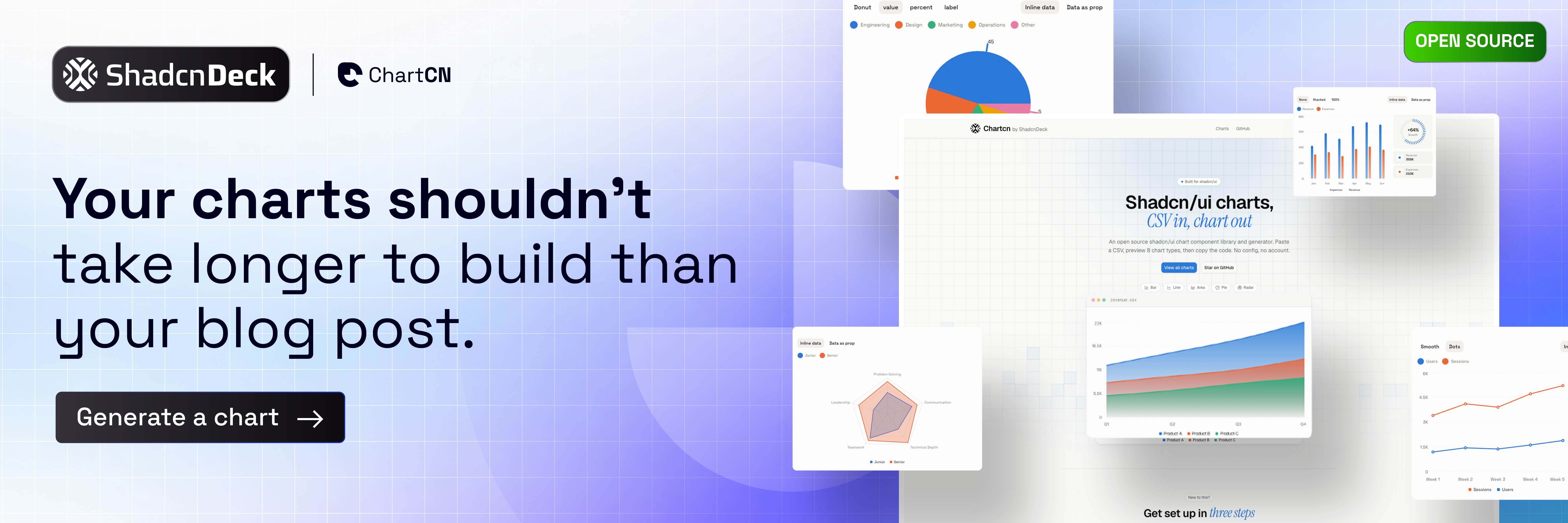
If you'd rather see the finished result before writing any code, our interactive chart gallery renders every family — bar, line, area, pie, and radar — as live blocks that already read your theme tokens.
What are shadcn charts and how do they work?
shadcn charts are not a wrapped library. They are composable chart blocks that use Recharts directly, so you own the code and can reach into any Recharts API without fighting an abstraction layer. The shadcn layer adds three things: a ChartContainer (handles ResponsiveContainer and CSS variable injection), ChartTooltip with ChartTooltipContent (a pre-styled tooltip), and ChartLegend with ChartLegendContent (a pre-styled legend).
Installation
Install the base chart component first:
Then add individual chart blocks from the registry, for example the interactive area chart:
All charts share a chartConfig object that maps data keys to labels, colours, and optional icons:
⚠️ Token format: reference chart colours as var(--chart-1) directly, not hsl(var(--chart-1)). Recent Recharts releases read the CSS variable straight from your theme.
11 shadcn chart variants you can build today
These 11 variants span area, bar, line, pie, radar, and radial families. Five use only Recharts built-in animation, and the rest layer in Framer Motion or CSS for count-up tickers, scroll triggers, and glow effects.
1. Gradient Area Chart (baseline, animated)
The most-used shadcn chart pattern. The built-in isAnimationActive draws the area in on mount, and the linearGradient SVG def creates the fill fade with no extra dependencies. If you need a different shape for the same data, the stacked and step area layouts start from this same config.
When to use it: Revenue trends, traffic overviews, MRR growth charts.
2. KPI Card with Animated Ticker (Framer Motion)
Wrap a stat in a shadcn Card and animate the number counting up from zero with Framer Motion's useMotionValue and animate. This pairs a headline metric with a sparkline, the most common dashboard header pattern.
$0
vs $7,620 last month
When to use it: SaaS dashboards, analytics overview pages, marketing report headers.
🧩 Building the card shell? The shadcn card component guide shows how to structure the header, content, and elevation that wrap every KPI chart above.
3. Stacked Bar Chart with Tab Switcher
Let users switch between weekly, monthly, and yearly views without unmounting the chart. This uses shadcn Tabs for the switcher and a key prop to replay the entrance animation on each switch. Grouped, horizontal, and negative-value versions of the same chart are in the bar chart collection.
Key detail: the key={period} prop on BarChart forces a remount on tab switch, which replays the entry animation. Without it, Recharts transitions the bars instead. The switcher itself comes straight from the shadcn tabs component.
4. Donut Chart with Center Stats
A donut chart that displays the total and a breakdown inside the hole. It renders SVG text at the centre with a custom Recharts label. For the solid, labelled, and interactive-slice takes on the same idea, see the pie and donut blocks.
When to use it: Plan breakdowns, device share, team allocation, budget splits.
5. Radar / Skills Chart
Radar charts suit performance profiling and skill matrices. This variant uses a gradient fill and a coloured stroke, a popular look for developer profile cards and team skill dashboards. Dotted-grid and multi-series comparisons of the same chart live in the radar chart set.
When to use it: Developer portfolio cards, team skill matrices, feature comparisons.
6. Radial Bar Chart (Goal Progress)
A RadialBarChart shows progress toward a goal. This variant adds a shadcn card shell with a large central percentage, the Lighthouse-score pattern you see on performance dashboards.
Performance Score
When to use it: Lighthouse scores, NPS dashboards, onboarding completion, goal widgets.
7. Live-Updating Line Chart (simulated real-time)
Simulate a live data stream by appending a new data point every second with setInterval. Recharts re-renders smoothly without a full remount, and a short 300ms animationDuration gives the line a real-time feel. Static multi-series, stepped, and dotted versions are ready to copy from the line chart examples.
When to use it: API latency monitors, server request dashboards, infrastructure health pages.
8. Glowing Dot Line Chart (CSS filter)
A line chart where the latest data point glows. The glow uses a CSS filter: drop-shadow() applied to a custom Dot component, so no SVG filter element is needed.
When to use it: MRR growth charts, weekly active user trends, sales pipeline velocity.
9. Forecast Line Chart with Shaded Zone
Show historical data as a solid line and a future forecast as a dashed line with a shaded uncertainty zone. This uses a Recharts ComposedChart with a second area series for the confidence band.
When to use it: Financial projections, demand forecasting, churn prediction dashboards.
10. Scroll-Triggered Bar Chart (Framer Motion + Intersection Observer)
Recharts plays its entrance animation once on mount. This variant delays the mount until the card scrolls into view with the Intersection Observer API, so the chart only animates when the user reaches it.
When to use it: Landing page marketing sections, blog post embedded charts, scrollable reports.
11. Multi-KPI Dashboard Row (4-up stat cards)
A four-column row of KPI cards, each with a tiny sparkline, a trend badge, and an animated count-up number. This is the top-of-page pattern for almost every SaaS analytics dashboard.
$0.0k
Total Revenue
0
Active Users
0.00%
Conversion
0
Orders
When to use it: Any SaaS analytics dashboard header. This is the first thing users see, so make it count.
All 11 variants at a glance
| # | Variant | Animation | Chart type | Extra deps |
|---|---|---|---|---|
| 1 | Gradient area chart | Recharts built-in | Area | None |
| 2 | KPI card with ticker | Framer Motion | Area (sparkline) | framer-motion |
| 3 | Stacked bar with tabs | Recharts + key remount | Bar | None |
| 4 | Donut with center stats | Recharts built-in | Pie | None |
| 5 | Radar / skills chart | Recharts built-in | Radar | None |
| 6 | Radial goal chart | Recharts built-in | RadialBar | None |
| 7 | Live-updating line chart | Recharts 300ms | Line | None |
| 8 | Glowing dot line chart | CSS drop-shadow | Line | None |
| 9 | Forecast with shaded zone | Recharts + stagger | ComposedChart | None |
| 10 | Scroll-triggered bar chart | Framer Motion + observer | Bar | framer-motion |
| 11 | Multi-KPI dashboard row | Framer Motion ticker | Area (x4) | framer-motion |
How to install shadcn charts
Run the one-liner below to add the base chart component to your project:
Then install Framer Motion if you use variants 2, 10, or 11:
For the chart to size correctly, always set a height on ChartContainer. Use a Tailwind class (h-64), a min-h-*, or an aspect-* utility. Without a measured height, the underlying ResponsiveContainer collapses to zero.
How shadcn chart theming works
Every chart reads from five CSS variables defined in your global stylesheet. These variables change automatically when the user switches between light and dark mode:
Reference them in Recharts props as var(--chart-1), not hsl(var(--chart-1)). The colours resolve straight from your theme.
🎨 Want to preview a custom chart palette first? The free shadcn theme generator lets you tune your --chart-* colours live, so every chart above inherits your palette without touching code.
Accessibility notes for every variant
Every variant above stays accessible. Recharts renders standard SVG, so keep these three rules in place:
- Respect reduced motion: gate the animated variants behind
prefers-reduced-motionso users who opt out get a static chart. - Label the chart: add
role="img"and anaria-label(for example, "Revenue trend Jan to Jun 2026") to the wrapper when the chart is the only representation of the data. - Keep tooltips keyboard-accessible: Recharts moves focus between data points, and the tooltip opens on focus, so do not disable that behaviour.
Frequently Asked Questions
Build a full dashboard faster with a shadcn template
Writing these chart components from scratch is a great way to learn. But if you need a complete analytics dashboard or SaaS landing page, with charts, KPI cards, dark mode, and a mobile layout already production-ready, ShadcnDeck's shadcn/ui landing page templates save you days of work.
Charts rarely ship alone either. The row of KPI cards at the top of a dashboard almost always sits above a sortable, paginated table of the same records, which is the other half of this build.
Start with the free shadcn/ui templates to see what ships at no cost, or browse the full template catalogue for premium options with priority support.
Related Posts
Explore more shadcn component guides: