
The shadcn card component is a composable container built from 6 sub-components — Card, CardHeader, CardTitle, CardDescription, CardContent, and CardFooter — that you own outright after running one CLI command. Every variant below is production-ready, fully typed in TypeScript, and styled with Tailwind CSS. You install it once, copy the examples you need, and ship.
What Sub-Components Make Up the shadcn/ui Card?
The shadcn/ui card ships as a set of 6 named exports, not a single monolithic element. Each sub-component maps to a distinct layout zone:
| Sub-component | Role | HTML element rendered |
|---|---|---|
Card | Outer wrapper — rounded border, background, shadow | <div> |
CardHeader | Top zone — holds title and description | <div> |
CardTitle | Primary label for the card | <div> (changed from <h3> for accessibility) |
CardDescription | Supporting text below the title | <div> (changed from <p> for accessibility) |
CardContent | Main body — anything goes here | <div> |
CardFooter | Bottom zone — primary actions, links | <div> |
The CardTitle and CardDescription elements were updated from <h3> and <p> to <div> in a recent changelog update to improve ARIA heading semantics — so you control your own heading hierarchy without the component injecting one.
Install the shadcn card component with one command:
Then import only the sub-components you need:
shadcn Card Component: Default Variant with Header and Footer
The default shadcn card variant is the most common starting point. Use it for notification panels, account summaries, or any grouped content block.
Build passed. 3 of 3 checks completed successfully.
This is the base pattern. CardHeader stacks above CardContent, which stacks above CardFooter. All three zones are optional — omit any you don't need.
How to Build a shadcn Card with an Image
Image cards are the standard pattern for blog post grids, product listings, and portfolio showcases. Place the image above CardHeader — outside all sub-components — so it bleeds to the card edge.
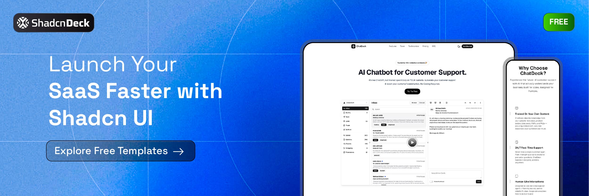
Production-ready landing page with hero, features, pricing, and FAQ.
Add overflow-hidden to Card so the image respects the card's rounded corners. Use Next.js Image with fill and object-cover to keep the image ratio stable as content below it changes length.
How to Embed a shadcn Form Inside a Card
The most common Next.js card component pattern in production is a Card wrapping a login, registration, or settings form. CardContent holds the form fields, and CardFooter holds the submit action.
Use space-y-4 inside CardContent to keep field spacing consistent without custom margin rules. The Label component correctly associates with its Input via matching htmlFor and id values — this is the minimum for screen reader accessibility.
How to Build a SaaS Pricing Card with shadcn/ui
The SaaS pricing section is one of the highest-value uses of the Tailwind card component shadcn pattern. A pricing card communicates tier, price, features, and a CTA in a single scannable block.
- Unlimited projects
- Custom domain
- Priority support
- Analytics dashboard
- Team collaboration
Use border-primary on the featured tier to draw the eye. Map your feature list from an array so adding or removing features doesn't require touching JSX structure. This pattern appears in every SaaS landing page template at ShadcnDeck — if you want this section pre-built and production-ready, browse the free shadcn/ui landing page templates instead of building from scratch.
Skip the build. Every ShadcnDeck template ships with a pricing section, hero, features, and FAQ — pre-assembled on Next.js App Router, TypeScript, and Tailwind CSS. Browse free shadcn/ui templates →
shadcn Card Hover Animations: 4 Creative Variants
Animated cards increase engagement on landing pages and portfolio grids. All 4 variants below require zero animation libraries — they use Tailwind CSS utilities, CSS transforms, and plain React event handlers.
1. Lift & Shadow (Pure Tailwind)
The simplest animated card variant. Three Tailwind utilities do all the work: transition-all duration-300 for the smooth transition, hover:-translate-y-1 to lift the card 4px, and hover:shadow-xl to deepen the shadow as it rises. Use the group / group-hover: pattern to cascade the effect to child elements without JavaScript.
The card lifts on hover. The title shifts to your primary colour. No animation library needed.
2. 3D Tilt Effect
The card tilts in 3D space as the cursor moves across it. An onMouseMove handler reads the cursor position relative to the card, converts it to rotateX / rotateY values, and applies them via perspective(600px). On onMouseLeave the transform resets. No library — just a ref, two event handlers, and inline style.
The card tilts in 3D space following your cursor. Perspective transform applied via onMouseMove — no library needed.
3. Spotlight / Cursor Glow
A glowing blob tracks the cursor across the entire window and shines through the card's edge. The trick is two invisible divs — .blob (the visible glow) and .fake-blob (a fixed anchor used to calculate offset). A single window mousemove listener drives all cards on the page at once via Element.animate(), which is hardware-accelerated and skips React re-renders entirely. The card itself sits above the blob on a p-px border wrapper, so the glow bleeds through the 1px gap.
Glide your cursor here and watch the glow follow — a spotlight that tracks your mouse.
4. Flip Card
The card has two faces — front and back — and rotates 180° on hover using CSS 3D transforms. transformStyle: "preserve-3d" on the container lets both faces exist in the same 3D space. Each face uses backfaceVisibility: "hidden" so only the forward-facing side is visible at any time. The back face starts pre-rotated 180° so it appears correctly when flipped.
shadcn Card Accessibility: What You Need to Know
The shadcn/ui card component is accessible by default, but correct usage requires 3 deliberate choices from you.
1. Control your heading hierarchy. CardTitle now renders a <div>, not an <h3>. This means you decide what heading level wraps it — or whether one wraps it at all. If the card lives inside an <article>, wrap CardTitle's content in the correct <h2> or <h3> yourself.
2. Associate every form input. If your card contains a form (see the login example above), every <Input> must have a matching <Label> with htmlFor pointing to the input's id. Screen readers rely on this association.
3. Add aria-label to icon-only actions. If you place icon-only Button components inside CardHeader or CardFooter, add aria-label="[action name]" to each. A close icon with no label is invisible to assistive technology.
The shadcn/ui Card has no dependency on Radix UI — it is a styled <div> composition, not a primitive. This means it carries no built-in ARIA roles. For interactive card patterns (a clickable card that navigates to another page), wrap the entire Card in a Link and add role="article" to the Card itself.
shadcn Card Examples: Which Variant Fits Your Use Case?
These 5 shadcn card examples cover the patterns that appear most often in production Next.js apps. All 5 variants use the same 6 sub-components — you are combining them differently, not swapping in different components.
| Use case | Variant | Key Tailwind additions |
|---|---|---|
| Notification / status panel | Default (header + content + footer) | w-[380px] |
| Blog grid / product listing | Image card | overflow-hidden, relative h-48 |
| Auth flow | Form inside card | space-y-4 in CardContent |
| SaaS pricing section | Pricing card | border-primary, shadow-lg |
| Portfolio / feature grid | Animated hover card | transition-all, hover:-translate-y-1, group |
The shadcn card component's composable architecture is what makes this possible. If you want all these patterns pre-assembled in a production landing page — hero, features, pricing cards, FAQ — that is exactly what the shadcn/ui templates at ShadcnDeck are built for. Every template runs on Next.js App Router, TypeScript, and Tailwind CSS, and ships with full source code.
Related Posts
Explore more shadcn component guides:
- shadcn accordion component guide
- shadcn tabs component guide
- shadcn tooltip component guide
- shadcn select component guide
- how to build a landing page with Next.js and shadcn/ui


