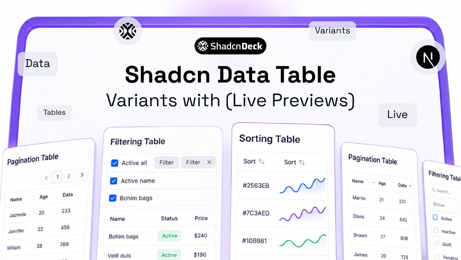
A shadcn data table is shadcn/ui's <Table /> primitive plus TanStack Table v8, which supplies the sorting, filtering, pagination, and row-selection logic. There is no standalone <DataTable /> component in the base install. You compose it yourself, which is exactly why you keep full control over columns, state, and styling.
The table is one of the harder pieces to assemble from scratch, so it helps to have the rest of the shadcn component set mapped out before you start.
This guide covers 8 variants, each with a live preview you can click through and the full code underneath: basic, sortable, searchable, paginated, selectable, hover-animated, column-toggled, and the combined version SaaS dashboards actually ship.
How does the shadcn data table work?
Two files, two responsibilities. columns.tsx declares what each field is called, how it renders, and which features it opts into. data-table.tsx holds the useReactTable hook and renders rows from whatever row model you enabled.
That split is deliberate. shadcn/ui copies source into your project instead of shipping a black box, so the table matches your design system without override wars, and TanStack Table stays headless: it computes rows and state, it never renders a single element. You own every <td> on the page.
The practical consequence is that features are opt-in. A table with only getCoreRowModel ships almost no logic. Add getSortedRowModel, getFilteredRowModel, and getPaginationRowModel and each one pulls in its own slice of work. That is the ordering the 8 variants below follow.
What do you need to install first?
Every variant in this guide starts from the same two commands. The first copies the table markup into components/ui/, the second adds the logic engine.
Variants 3 through 8 also use the input, button, checkbox, and dropdown primitives for the toolbar and the selection column:
Before you start, confirm three things about the project:
- React 18 or newer. TanStack Table v8 targets the modern hooks API.
- TypeScript. Not required, but the generic
ColumnDef<TData>types are where most of the autocomplete value lives. - A client boundary. Every table file below opens with
"use client"because the hook keeps state.
Where do the column definitions live?
All 8 variants share one columns.tsx file. A column definition is a plain object: accessorKey points at a field on your row type, header renders the heading cell, and cell takes over rendering for that column when the raw value is not what you want on screen.
Currency formatting belongs here, not in the table component. Keeping presentation logic inside the column definition means the sortable and paginated variants below inherit it for free, and a column can be moved between tables without dragging formatting code along with it.
Which of the 8 variants do you need?
Each variant adds exactly one capability to the one before it. Find the row that matches what your screen has to do, then jump to that section.
| Variant | What it adds | Best for |
|---|---|---|
| 1. Basic | getCoreRowModel only | Static reference lists under 20 rows |
| 2. Sortable | getSortedRowModel | Invoices, leaderboards, anything ranked |
| 3. Search | getFilteredRowModel | Admin panels and user lists |
| 4. Pagination | getPaginationRowModel | Datasets past roughly 50 rows |
| 5. Row selection | rowSelection state | Bulk delete, export, tagging |
| 6. Hover animation | CSS transition, no new state | Dense tables with 8 or more columns |
| 7. Column visibility | columnVisibility state | Reports with role-specific fields |
| 8. Full-featured | All four row models, four state objects | SaaS admin dashboards |
8 shadcn data table variants with live previews
Every preview below runs the real component, not a screenshot. Sort a column, type in the filter, page through the rows, then open the Code tab for the file that produced it.
1. Basic Data Table
The basic version enables one row model and nothing else. It renders whatever array you hand it, in the order you hand it, and includes the empty state that keeps a table from collapsing to a bare header when a fetch comes back with zero rows.
| Status | Amount | |
|---|---|---|
| success | ken99@example.com | $316.00 |
| success | abe45@example.com | $242.00 |
| processing | monserrat44@example.com | $837.00 |
| success | silas22@example.com | $874.00 |
| failed | carmella@example.com | $721.00 |
flexRender is the piece worth understanding. A header or cell definition can be a string, a function, or a React component, and flexRender resolves all three to the same output. Every variant below reuses this exact body and only changes the hook configuration above it.
2. Sortable Data Table
Sorting needs two additions: getSortedRowModel in the hook and a sorting state array that TanStack Table writes to. The header becomes a button that cycles ascending, descending, and back to unsorted.
| success | ken99@example.com | $316.00 |
| success | abe45@example.com | $242.00 |
| processing | monserrat44@example.com | $837.00 |
| success | silas22@example.com | $874.00 |
| failed | carmella@example.com | $721.00 |
column.getIsSorted() returns 'asc', 'desc', or false, so passing it into toggleSorting gives you the three-state cycle without tracking direction yourself. If you want a column locked in one direction, set enableSorting: false on the ones that should never move, which is what the checkbox column in Variant 5 does.
🎨 Muted headers fighting your brand? Table rows, borders, and hover states all read from the same handful of CSS variables. Try a different palette across your whole app with the free shadcn theme editor before you start overriding class names cell by cell.
3. Data Table with Search and Filtering
A filter input above the table narrows rows as you type, with no page reload and no refetch. getFilteredRowModel does the matching, and columnFilters state records which column is being filtered and by what.
| Status | Amount | |
|---|---|---|
| success | ken99@example.com | $316.00 |
| success | abe45@example.com | $242.00 |
| processing | monserrat44@example.com | $837.00 |
| success | silas22@example.com | $874.00 |
| failed | carmella@example.com | $721.00 |
| pending | jonah@example.com | $129.00 |
| processing | aisha@example.com | $455.00 |
| failed | devon@example.com | $168.00 |
This filters a single column. For a search box that scans every column at once, swap columnFilters for globalFilter state and pass onGlobalFilterChange instead. For a status dropdown rather than free text, feed the chosen value into setFilterValue from a controlled Select trigger, and for a created-between range, pull the dates from a calendar-backed range picker and write a small custom filterFn.
4. Data Table with Pagination
Pagination stops the browser rendering thousands of DOM nodes at once. getPaginationRowModel slices the rows, and the footer buttons move the page index. The default page size is 10 rows.
| Status | Amount | |
|---|---|---|
| success | ken99@example.com | $316.00 |
| success | abe45@example.com | $242.00 |
| processing | monserrat44@example.com | $837.00 |
| success | silas22@example.com | $874.00 |
Two details that get missed. getCanPreviousPage() and getCanNextPage() exist so the buttons disable themselves at the boundaries, and initialState sets the page size once without making it controlled. If you need a page size the user can change, move it into state and pair it with onPaginationChange. The outline size-sm pairing above is the standard footer look, and the other button variants cover what to reach for when it needs to be louder.
5. Data Table with Row Selection and Bulk Actions
Row selection adds a checkbox column plus a rowSelection state object keyed by row id. The bulk action bar reads the selected count and appears only when something is selected, which is the pattern Gmail uses for archive and delete.
| Status | Amount | ||
|---|---|---|---|
| success | ken99@example.com | $316.00 | |
| success | abe45@example.com | $242.00 | |
| processing | monserrat44@example.com | $837.00 | |
| success | silas22@example.com | $874.00 | |
| failed | carmella@example.com | $721.00 |
The header checkbox is the fiddly part. Returning the string 'indeterminate' when only some rows are checked is what produces the dash instead of a tick, and it works because the underlying primitive accepts a three-state value. The checkbox guide walks through that indeterminate state and the accessibility rules around it in more detail. Also note getFilteredSelectedRowModel() rather than getSelectedRowModel(): use the filtered variant so a hidden row from a previous search never gets swept into a bulk delete.
6. Data Table with Hover Row Animation
This variant changes no TanStack configuration at all. It is a CSS transition on TableRow, running at 150ms with an inset left border that marks the row under the cursor. Hover the preview to see it.
| Status | Amount | |
|---|---|---|
| success | ken99@example.com | $316.00 |
| success | abe45@example.com | $242.00 |
| processing | monserrat44@example.com | $837.00 |
| success | silas22@example.com | $874.00 |
| failed | carmella@example.com | $721.00 |
Because it is transition-colors and not a JavaScript animation library, it costs nothing in bundle size and there is no layout shift to guard against. If you do add motion beyond a colour fade, gate it behind motion-reduce:transition-none, the same discipline that applies to scroll-triggered fade effects. One caveat worth naming: cursor-pointer promises the row is clickable, so either wire up a row click handler or drop that class.
7. Data Table with a Column Visibility Toggle
A dropdown lets users hide columns they do not need. TanStack Table tracks columnVisibility and skips hidden columns entirely, so nothing hidden is rendered off screen or clipped with CSS.
| Status | Amount | |
|---|---|---|
| success | ken99@example.com | $316.00 |
| success | abe45@example.com | $242.00 |
| processing | monserrat44@example.com | $837.00 |
| success | silas22@example.com | $874.00 |
| failed | carmella@example.com | $721.00 |
The getCanHide() filter is what keeps a selection checkbox or a row-actions column out of the menu, and it pairs with the enableHiding: false flag from Variant 5. One limitation: column.id is the raw field name, so a column called created_at shows up looking like a database field. Add a meta: { label: "Created" } entry to the column definition and read it in the menu for anything user-facing.
DropdownMenu and Checkbox are both Radix-backed in the current CLI output, which matters if you are tracking the primitive migration described in our breakdown of Radix and Base UI.
8. Full-Featured Data Table
This is the shadcn table with pagination and search that most people are actually looking for: sorting, a filter input, pagination, row selection, hover feedback, and a column toggle in one component. Four row models, four state objects, one state block.
| success | ken99@example.com | $316.00 | |
| success | abe45@example.com | $242.00 | |
| processing | monserrat44@example.com | $837.00 | |
| success | silas22@example.com | $874.00 | |
| failed | carmella@example.com | $721.00 |
If the table also needs manual ordering, note that drag-to-reorder rows bolts onto this same component through dnd-kit, though it has to be reconciled with sorting rather than simply added alongside it.
Order matters in the hook config. getFilteredRowModel runs before getPaginationRowModel, which is why filtering recalculates the page count instead of leaving you on an empty page 4. Selection is stored by row index by default, so pass getRowId when your rows have stable database ids and you want a selection to survive a refetch.
A table like this rarely lives alone. It usually sits inside a dashboard shell with a resizable sidebar on the left and a sticky header with a command palette across the top, with a row of charts above the table summarising the same data. An area chart for the trend and a compact bar chart for the breakdown is the pairing that shows up most often.
⚡ Would you rather start from a working dashboard? The ChatDeck SaaS template ships the table pattern above inside a full Next.js app shell, so the toolbar, footer, and empty state are already assembled and themed.
When should you switch to server-side sorting and pagination?
Switch when the full dataset stops fitting comfortably in the browser, which in practice is somewhere past a few thousand rows. Everything above is client-side: TanStack Table receives the whole array and slices it. That is the right default, and it is fast, but it means every row travels over the network before the user sees page 1.
Going server-side is a configuration change, not a rewrite. Turn off the row model, turn on the manual flag, and report the total page count from your API.
Note what disappears: getPaginationRowModel and getSortedRowModel are gone, because the database is doing that work now. The table becomes a controlled component that reports intent, and your query layer answers it. Row selection is the one piece that needs care here, since ids from page 2 stay in state after page 3 loads, which is usually what you want for a cross-page bulk action but surprising if you assumed otherwise.
One honest caveat for 2026: client-side filtering feels instant and server-side filtering never will, so debounce the filter input by 300ms and keep the previous page visible while the next one loads. If your users switch between several saved views of the same dataset, a tab bar above the table reads better than another dropdown in the toolbar.
Is a shadcn data table accessible by default?
Mostly. Every variant renders a real <table> with <th> and <td> elements, so screen readers announce rows and columns correctly with no work from you. The gaps appear once you add interactive headers and checkboxes. Four rules close them:
- Label every checkbox. The select-all control needs
aria-label="Select all rows"and each row checkbox needs one naming the record. Without it, a screen reader announces eight identical "checkbox" controls. - Announce sort state on the header cell. The icon is visual only. Put
aria-sortwithascending,descending, ornoneon the<th>, derived fromcolumn.getIsSorted(). - Label the filter input. A placeholder is not a label. Add
aria-labelor a visually hidden<label>, since placeholder text vanishes the moment someone types. - Do not hide meaning in a hover state. The row highlight in Variant 6 is a convenience, never the only signal. Anything that matters has to survive keyboard-only navigation.
For long cells, resist truncating with text-ellipsis alone, because the full value then exists nowhere for keyboard users. A focus-triggered tooltip is the accessible way to reveal the rest.
Which shadcn data table should you build?
Start at the lowest variant that does the job and move up only when a real requirement pushes you. Under 20 rows that never change, Variant 1 is the whole answer and anything more is overhead. Add sorting the moment users compare values across rows, and add filtering the moment they scan for one specific record.
Past roughly 50 rows, pagination stops being optional. Row selection is worth it only if a bulk action actually exists on the other side, and column visibility only if different roles genuinely need different fields. Variant 8 is the destination for an admin dashboard, not the starting point for a pricing page.
If the table is a small part of a larger build, borrow the composition instead of writing it. ShadcnDeck's shadcn/ui templates ship the composed pattern already themed, and the free tier is enough to see how the pieces fit together before you commit to a structure. When you do want the table in a bordered card with a header and description, that wrapper is the last 10 lines rather than a rewrite.
For the reference implementation this guide builds on, see the official shadcn/ui data table docs and the TanStack Table v8 API.
Related Posts
Keep building out the dashboard around this table:
- 10 best AI SaaS landing page templates - premium templates whose dashboards already ship a table like this one
- shadcn charts guide - the summary row that usually sits above a data table
- shadcn checkbox guide - including the indeterminate state the select-all header depends on
- shadcn header guide - the app shell that goes above the table
- shadcn resizable sidebar guide - the other half of a dashboard layout
- shadcn select component guide - for status and page-size dropdowns in the toolbar
- shadcn date picker guide - for date-range column filters
- shadcn drag and drop guide - add drag-to-reorder rows on top of this table
- shadcn component libraries - where to find table extensions worth copying
- best React UI libraries in 2026 - how shadcn/ui compares if you are still choosing a stack