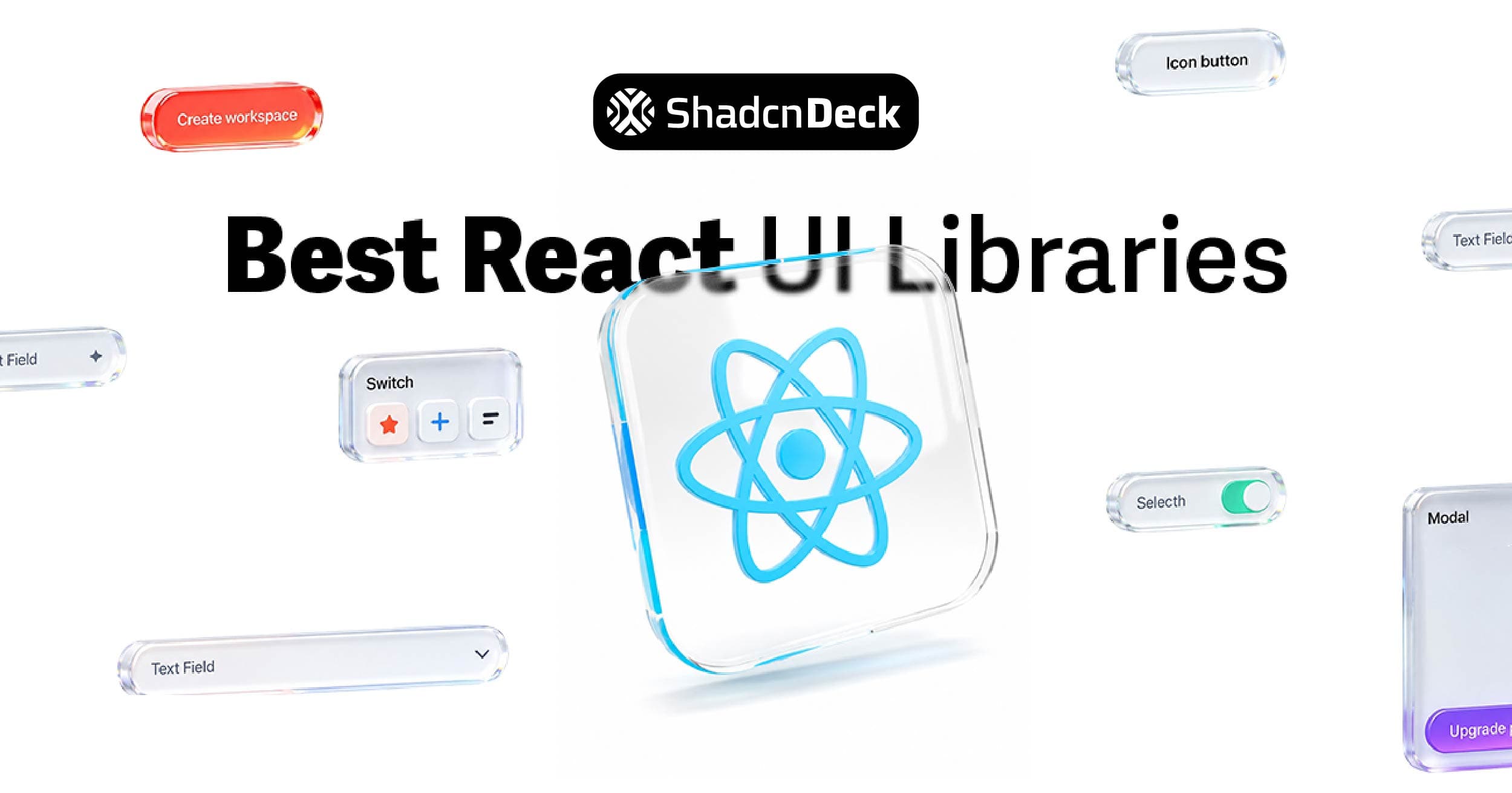
Choosing a React UI library is one of the first decisions you make on a new project and one of the hardest to undo six months in. Pick the wrong one and you're fighting its opinions on every custom screen. Pick the right one and your team ships components in minutes instead of hours.
The problem is that "best" depends entirely on what you're building. A library that's perfect for an enterprise dashboard is overkill for a two-week MVP. A headless primitive library that's ideal for a design system is frustrating for a solo developer who just wants a working data table.
This guide breaks down 17 battle-tested React UI libraries in 2026, categorized by use case, with current adoption numbers, honest tradeoffs, and a clear recommendation for each scenario.
What Is a React UI Library?
A React UI library is a collection of pre-built, reusable components: buttons, forms, modals, navigation bars, data tables. Designed for React applications. Instead of writing every interaction from scratch, you import tested components and customize them for your product.
| Without a UI Library | With a UI Library |
|---|---|
| Write CSS for every button | Import <Button> and tweak props |
| Build modal logic from scratch | Use <Modal> with built-in accessibility |
| Style forms manually | Use <Form> with validation helpers |
| Weeks on UI boilerplate | Days shipping actual features |
A good library gives you speed, visual consistency, baked-in accessibility, and enough customization to match your brand. For founders and indie hackers, that means fewer hours on pixels and more hours on product.
How to Read This Guide
Libraries here fall into four categories:
- Full design systems: pre-styled, opinionated, ship fast out of the box
- Tailwind-first / code-ownership: you own the code, customize fully
- Headless / unstyled: behavior and accessibility without visual opinions
- Specialized: built for specific use cases like dashboards, data tables, or enterprise admin
Full Design Systems
These libraries ship complete visual languages. Components look polished immediately without heavy customization. The tradeoff is that you're working within their design opinions.
1. Material UI (MUI)
GitHub stars: 95,000+ | Weekly downloads: 5.8M | Version: v6
MUI implements Google's Material Design in React. It's the most widely adopted React component library by a distance, used by Spotify, Amazon, and Netflix at scale.
The ecosystem is massive: MUI Core for standard components, MUI X for advanced data grids, date pickers, and charts, and MUI Base for headless primitives. Documentation is thorough, TypeScript support is first-class, and the community answers questions fast.
MUI v6, released in late 2025, reduced bundle size by roughly 30% and improved server-side rendering performance.
The tradeoff is design lock-in. Material Design has a specific look. Customizing it to match a non-Material brand takes significant effort, not impossible, but not trivial either. For a closer look at the tradeoffs, our in-depth shadcn versus Material UI breakdown walks through bundle size, theming, and RSC compatibility side by side.
Best for: Enterprise dashboards, teams that need broad component coverage, projects where consistency matters more than design differentiation.
Pricing: Free (MIT). MUI X advanced components have Pro and Premium paid tiers.
2. Ant Design
GitHub stars: 94,000+ | Weekly downloads: 1.7M
Ant Design is purpose-built for enterprise applications. Dense tables, complex forms, multi-step workflows, internationalization: this is where it performs. Alibaba built it for internal tooling and it shows: the components are designed for data-heavy interfaces, not consumer-facing products.
Built-in form validation, data handling utilities, and i18n support reduce the need for additional libraries. TypeScript support is strong throughout.
The downside is the same as MUI but more pronounced. Ant Design looks like Ant Design. The design language is clean and professional, but adapting it to a different brand requires overriding deeply nested CSS. If you're building an internal admin tool, that's fine. If you're building a consumer product with a strong visual identity, it's a fight.
Best for: Internal tools, admin panels, enterprise apps where tables and forms do most of the work.
Pricing: Free (MIT).
3. Chakra UI
GitHub stars: 38,700 | Weekly downloads: 533K
Chakra UI prioritizes developer experience and accessibility above everything else. The API is intuitive: style components with props like bg="blue.500" and p={4}, which makes it fast to prototype and easy to read later.
Dark mode is built in. Every component meets WCAG accessibility standards. The theming system is powerful without being complex. The Chakra team also built Ark UI, a headless alternative for teams that outgrow the styled approach.
The tradeoff is bundle size and performance at scale. Chakra uses CSS-in-JS at runtime, which adds overhead compared to Tailwind-first alternatives. For most projects, this doesn't matter. For performance-critical applications, it does.
Best for: Teams that prioritize developer experience and accessibility, SaaS apps, projects where the API ergonomics matter as much as the output.
Pricing: Free (MIT).
Tailwind-First / Code Ownership
These libraries give you components you own entirely. No npm package updates that break your UI. No fighting library defaults. You get the component code, drop it in your project, and it's yours.
4. shadcn/ui
GitHub stars: 115,000+ | Current version: N/A (no installable package)
shadcn/ui is the fastest-growing library in the React ecosystem, and it's technically not a library. It's a collection of copy-paste components built on Radix UI primitives and Tailwind CSS. You run the CLI, it copies component code into your project, and you own every line.
The result: no version conflicts, no forced upgrades, no bundle size from components you don't use. When you need to customize, you edit the file directly rather than fighting a theme system.
Design quality is where shadcn/ui stands apart from full design systems. Components look modern and production-ready out of the box, not like generic library defaults.
The AI tooling advantage is significant in 2026. v0.dev, Lovable, Bolt, and Claude Code all generate shadcn/ui by default. If your team uses AI coding tools, you're already getting shadcn/ui output. That feedback loop has driven adoption faster than any other library in recent memory — our piece on why shadcn adoption exploded in 2026 unpacks the full story. To see what teams are actually shipping with it, browse the real-world projects powered by shadcn.
🚀 Building with shadcn/ui and need a head start? The free shadcn templates cover SaaS landing pages and UI patterns already assembled. The shadcn theme generator lets you dial in your color system before writing a single component.
Best for: Consumer-facing products, design-forward SaaS apps, teams using AI coding tools, developers who want full code ownership.
Pricing: Free (MIT).
5. Mantine
GitHub stars: 31,000+ | Weekly downloads: 1.9M | Current version: v9
Mantine is the fastest-shipping full-featured library in the ecosystem. Install it, wrap your app in MantineProvider, and you have 120+ components and 100+ hooks ready to go: forms, date pickers, modals, notifications, charts, rich text editors.
The hooks library alone is worth evaluating: useForm, useDebounce, useMediaQuery, useClickOutside, useClipboard, and 90+ more. If you're reaching for custom hooks repeatedly, Mantine likely ships them.
The tradeoff is design character. Mantine looks functional and professional, ideal for dashboards and admin tools, but doesn't have the visual distinctiveness of shadcn/ui for consumer-facing products.
⚖️ Deciding between Mantine and shadcn/ui? The Mantine vs shadcn/ui comparison breaks down setup speed, component availability, AI tooling, and long-term maintenance in detail.
Best for: B2B SaaS dashboards, admin panels, teams with junior developers who need clear documentation, projects where time-to-market beats design differentiation.
Pricing: Free (MIT).
6. HeroUI (formerly NextUI)
GitHub stars: 28,200 | Current version: v2 (v3 in beta)
HeroUI, rebranded from NextUI in 2025, is a modern Tailwind-native component library with a strong focus on aesthetics and accessibility. Built on React Aria rather than Radix UI, which gives it a different accessibility primitive model from most of the ecosystem.
Components look polished from the start. The API is clean and the theming system is flexible. v3 in beta introduces further performance improvements.
The tradeoff is a smaller component set than Mantine and a smaller community than MUI or shadcn/ui.
Best for: Consumer-facing apps, teams that want Tailwind-native components with strong visual defaults.
Pricing: Free (MIT). Pro for extended themes and enterprise features.
Headless / Unstyled
These libraries handle behavior and accessibility without touching visual design. You bring your own styles. They're ideal for custom design systems where you need precise control.
7. Radix UI
GitHub stars: 35,000+ | Weekly downloads: 2M+
Radix UI is the foundation that shadcn/ui builds on. It provides low-level accessible primitives: dialogs, popovers, sliders, dropdowns, and menus, with WAI-ARIA compliance, keyboard navigation, and focus management handled automatically.
No styles ship with Radix. You pair it with Tailwind, CSS Modules, or whatever styling system your project uses. The component API is consistent and well-documented.
For most teams, using shadcn/ui (which wraps Radix) makes more sense than using Radix directly. Use Radix directly if you're building a custom design system from scratch and don't want shadcn/ui's opinionated defaults. Weighing the primitive layer itself? See our Radix vs Base UI comparison — as of July 2026 shadcn/ui defaults to Base UI.
Best for: Custom design systems, teams that want full visual control with solid accessibility primitives.
Pricing: Free (MIT).
8. Headless UI
GitHub stars: 28,000+ | Weekly downloads: 2.6M
Headless UI, built by the Tailwind CSS team, provides unstyled accessible components such as menus, dialogs, tabs, and transitions, designed to be paired with Tailwind classes. The API surface is smaller than Radix UI, which makes it easier to learn but limits it to simpler use cases.
If your project only needs basic accessible components and you're already using Tailwind, Headless UI is the path of least resistance. For more complex component needs, Radix UI covers more ground.
Best for: Tailwind-based projects that need basic accessible primitives without the broader Radix UI ecosystem.
Pricing: Free (MIT).
9. Ariakit
GitHub stars: 8,500+
Ariakit provides fully accessible, composable primitives for building custom UI. TypeScript-friendly, lightweight, and performant. Similar in philosophy to Radix UI but with a different API surface and smaller community.
Best for: Developers building fully custom design systems who want Ariakit's specific composability model.
Pricing: Free (MIT).
Specialized Libraries
These cover specific use cases: enterprise data interfaces, Bootstrap-based systems, or particular design philosophies.
10. Blueprint UI
GitHub stars: 20,000+
Blueprint UI, built by Palantir, is designed for complex, data-intensive interfaces: dashboards, admin panels, and internal tools. TypeScript-first, accessible, and opinionated toward desktop-first applications. Strong component coverage for tables, forms, date pickers, and interactive data components.
Not mobile-first. Heavier than most libraries. Best suited for applications where data density matters more than visual lightness.
Best for: Desktop-first enterprise dashboards and internal tools.
Pricing: Free (MIT).
11. PrimeReact
GitHub stars: 8,200+
PrimeReact ships 80+ components including advanced data tables, charts, tree views, and forms. Supports theming, accessibility, and RTL layouts. One of the most comprehensive component sets in the ecosystem.
The tradeoff is bundle size and a steeper learning curve. For complex enterprise apps that need breadth out of the box, it's hard to match.
Best for: Enterprise apps that need a wide component set without building custom implementations.
Pricing: Free (MIT). Premium themes available.
12. Core UI
Core UI provides React components designed for dashboard and admin interfaces. Includes charts, tables, modals, and forms with built-in responsive layouts and admin panel templates. Faster than building admin panels from scratch.
Best for: Admin dashboards and internal tools where speed of implementation beats design customization.
Pricing: Free (MIT). Pro version available.
13. Evergreen
Evergreen, built by Segment, is designed for modern web apps that need simplicity and composability. Clean components, lightweight integration, responsive design support. Smaller community than MUI or Ant Design, but well-documented.
Best for: SaaS products and internal tools where a clean aesthetic and fast setup matter.
Pricing: Free (MIT).
14. Grommet
Grommet focuses on accessibility and responsive design. Flexible theming, a prebuilt grid system, and ARIA support throughout. Works well for apps that need to serve diverse devices and meet accessibility requirements.
Best for: Accessibility-first applications that need responsive components out of the box.
Pricing: Free (MIT).
15. Reactstrap
Reactstrap brings Bootstrap 5 components to React. If your project already uses Bootstrap or your team knows it well, Reactstrap removes the need to rewrite familiar patterns. Fully responsive and mobile-first.
The limitation is Bootstrap's design language. Diverging significantly from Bootstrap aesthetics requires painful customization.
Best for: Projects migrating from Bootstrap, teams already comfortable with Bootstrap patterns.
Pricing: Free (MIT).
16. Theme UI
Theme UI is a React library for building scalable, themeable UI systems using design tokens: colors, typography, and spacing, all defined in a single theme object. More of a styling framework than a component library. Works well for design-system-driven projects that need token-level consistency.
Best for: Design systems that need rigorous token-based consistency across a large codebase.
Pricing: Free (MIT).
17. Shards React
Shards React is a lightweight React library with modern, responsive components. Minimal bundle size, fast setup, mobile-first. Smaller component set and community than the libraries above, but a clean starting point for simple projects.
Best for: Simple MVPs or projects that need a lightweight starting point without heavy dependencies.
Pricing: Free (MIT).
How to Pick the Right One
| Scenario | Library |
|---|---|
| Enterprise dashboard, broad component set | MUI or Ant Design |
| SaaS app, design matters, AI coding tools | shadcn/ui |
| Fast MVP, junior dev team | Mantine |
| Consumer product, Tailwind-native | HeroUI |
| Custom design system, full control | Radix UI |
| Accessibility-first, simple primitives | Headless UI |
| Data-heavy internal tool, desktop-first | Blueprint UI or PrimeReact |
| Bootstrap-based project | Reactstrap |
One practical check before committing: look at the library's GitHub commit history. A library with thousands of stars but no commits in six months is a liability. Active maintenance, responsive issue handling, and regular releases matter more than star counts for long-term projects.
The Bottom Line
For most new React projects in 2026, shadcn/ui is the starting point worth evaluating first, given its design quality, code ownership, AI tooling compatibility, and an active ecosystem. MUI is the right answer when you need the broadest possible component coverage and a proven enterprise ecosystem. Mantine sits between them: faster to set up than shadcn/ui, more flexible than MUI.
For headless control, Radix UI is the strongest primitive library available. For specialized dashboards and admin tools, Blueprint UI and PrimeReact cover more ground than any Tailwind-first alternative.
Pick based on what your project needs today, not what covers every possible future scenario. The library you choose should make shipping faster, not slower.
Related Posts
Build faster with shadcn/ui:
- Mantine vs shadcn/ui - A head-to-head comparison covering setup speed, hooks, AI tooling, and long-term maintenance
- Shadcn Accordion Component Guide - 12+ production-ready accordion patterns for FAQs and navigation
- Shadcn Tabs Component Guide - Tabbed interfaces with 12+ variants and animations
- Shadcn Chat UI Guide - Build modern chat interfaces with message bubbles and typing indicators
- Free Shadcn Templates - 15 production-ready shadcn/ui templates for landing pages and SaaS apps
- shadcn/ui vs Material UI - Code ownership, bundle size, and theming compared head to head
- shadcn/ui Projects and Examples - Production apps and open-source showcases built with shadcn/ui
- The Rise of shadcn/ui in 2026 - How a side project became the default React UI stack


