
In late 2022, a developer going by "shadcn" pushed a small project to GitHub. No marketing. No launch thread. Just a collection of copy-paste React components built on Radix UI primitives and Tailwind CSS.
By March 2026, that project had crossed 115,000 GitHub stars, was named the #1 most popular JavaScript project of 2024 by the JavaScript Rising Stars report, and had become the default component system for most new React and Next.js projects. v0.dev, Lovable, Bolt, Cursor, and Claude Code all generate shadcn/ui by default.
None of that happened by accident.
What shadcn/ui Actually Is
Most developers describe shadcn/ui as a component library. The creator explicitly says it isn't.
shadcn/ui is a collection of reusable components you copy into your project. There's no npm package to install, no version to update, no external dependency to manage. You run the CLI, components land in your codebase, and from that point on they're yours.
That command doesn't install a package. It copies a button.tsx file into your /components/ui folder. The file is yours. Edit it, delete lines, add variants. No library constraints, no fighting defaults.
Built on two foundations: Radix UI handles accessibility (WAI-ARIA roles, keyboard navigation, focus management) and Tailwind CSS handles styling. shadcn/ui bridges them into ready-to-use components with sensible defaults and a clean visual language.
Why It Took Off
The frontend world in 2022 had a clear frustration: developers were tired of fighting their UI libraries.
MUI required navigating createTheme, styleOverrides, and TypeScript module augmentation just to add a custom button variant. Chakra UI used CSS-in-JS at runtime, adding overhead. Bootstrap locked you into its design language. Every library had the same core problem: it made decisions for you, and undoing those decisions was expensive.
shadcn/ui solved this without building something new. It combined two tools developers already trusted, Radix UI and Tailwind, and made the output yours from day one.
The timing was precise. Tailwind CSS had already proven that developers wanted utility-first, low-level control over styling. shadcn/ui extended that philosophy to components: instead of a styled black box, you get the source code.
Three things drove early adoption:
Code ownership. You copy the source. If the upstream repo gets a bug fix, you choose when to update. If your product needs something the component doesn't support, you edit the file. No workarounds, no waiting for a library maintainer.
Design quality. Components look production-ready without heavy customization. They don't look like generic library defaults; they look like a product someone cared about. Even individual primitives like the hands-on shadcn button guide and building cards with shadcn show how much thought went into defaults. That distinction matters for developers building consumer-facing products.
Stack alignment. shadcn/ui fits the modern startup stack directly: Next.js for routing, Tailwind for styling, Radix for accessibility, Vercel for deployment. No configuration bridges, no compatibility patches.
Who Is shadcn?
The short answer: nobody knows, and that's intentional.
The creator goes by "shadcn", the same name as the project. The now-iconic profile image (a character from Rick and Morty) has become a brand in the frontend world without ever revealing the person behind it. Multiple publications have speculated on the identity. None have confirmed anything. The community has largely stopped asking.
What's clear from the work: the creator thinks carefully about developer experience, understands the practical frustrations of working with component libraries at scale, and has been careful about how the project evolves. The anonymous identity has, if anything, focused attention on the work rather than the person, which suits the philosophy of code ownership well.
In 2023, it emerged that shadcn joined Vercel. The move made the Vercel ecosystem connection official and likely contributed to shadcn/ui becoming the default output of v0.dev.
The JavaScript Rising Stars Milestone
In January 2025, the JavaScript Rising Stars 2024 report named shadcn/ui the most popular JavaScript project of the year, measured by net new GitHub stars. It beat out every framework, every runtime, every tooling project in the ecosystem.
For context: this is a report that has previously highlighted React, Vite, and Bun. shadcn/ui, a component collection with no runtime, topped all of them in 2024.
That milestone confirmed what the adoption numbers already showed: this wasn't niche developer enthusiasm. It was a broad shift in how the React community builds interfaces.
Registry 2.0: The Next Phase
In 2025, shadcn/ui launched Registry 2.0, a significant evolution that moved beyond single components toward shareable, installable UI registries.
The model: any developer or company can publish a component registry that others can install via the shadcn CLI. Instead of just copying components from the official library, teams can pull from internal design systems, third-party registries, or community collections with the same single-command workflow.
This turned shadcn/ui from a component collection into infrastructure for the broader component ecosystem. Block libraries like Shadcnblocks (1,350+ blocks), Tailark, and Shadcn Studio all built on top of this. The result is an ecosystem with more production-ready UI than any single library has ever shipped.
🎨 Configuring your shadcn/ui theme? The shadcndeck Theme Generator lets you dial in colors, typography, and border radii before writing a single component; changes propagate instantly via CSS variables.
The AI Tooling Connection
The AI development tools that have become standard in 2026, including v0.dev, Lovable, Bolt, Cursor, and Claude Code, all generate shadcn/ui by default.
This isn't coincidence. Because shadcn/ui components are plain files in your project, AI tools can read, modify, and generate them accurately. There's no package abstraction to work around, no runtime magic to understand. The component is a TypeScript file, which is exactly what language models handle well.
The feedback loop compounds: more developers use AI tools, AI tools output shadcn/ui, more developers adopt shadcn/ui, more shadcn/ui content trains future models. By 2026, that cycle has run long enough that switching away from shadcn/ui in an AI-assisted workflow creates real friction.
For a solo developer prompting v0.dev for a landing page or a team using Cursor for component scaffolding, shadcn/ui is already the output. The tooling chose it before many developers made a conscious decision.
The Ecosystem That Grew Around It
shadcn/ui didn't stay a component library. It became the foundation for a developer economy.
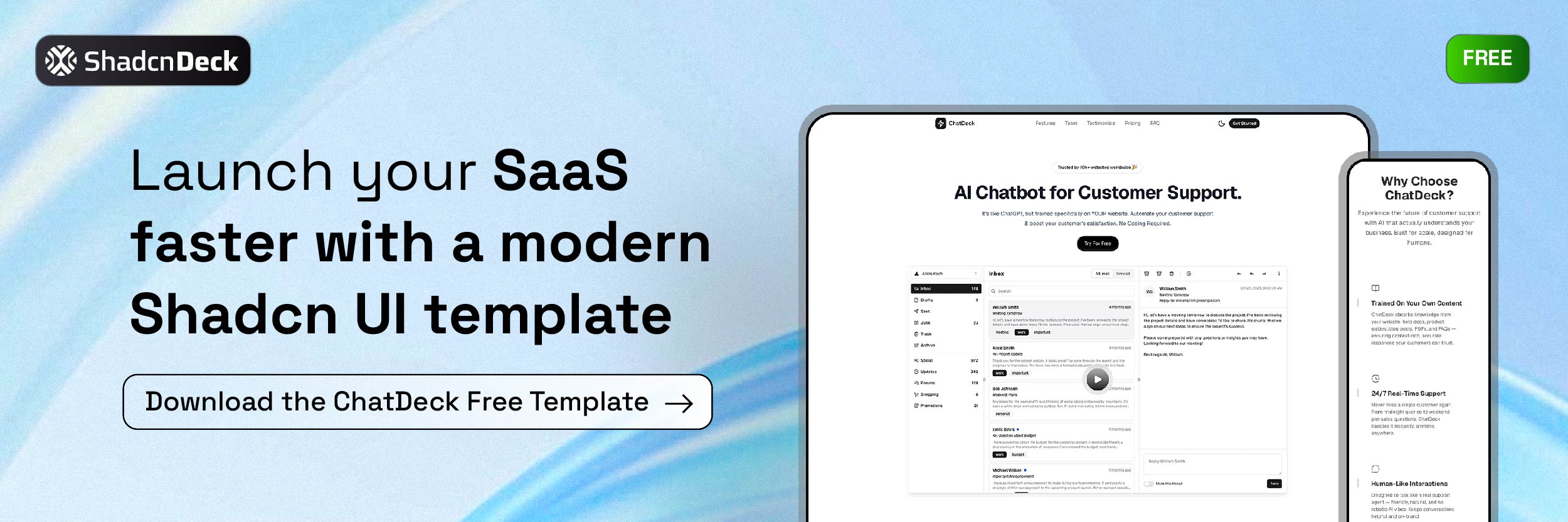
Templates and starter kits: Indie developers build and sell SaaS dashboards, landing pages, and full-stack starter kits bundled with Next.js, Prisma, Supabase, and Stripe. Prices in 2026 range from $49 for standalone page templates to $399 for complete SaaS starters with auth and billing. Some makers report $2,000 to $15,000 per month from shadcn/ui-based products alone.
Block libraries: Shadcnblocks, Tailark, and Magic UI ship hundreds of pre-built page sections installable via the registry. Production-ready marketing pages, dashboard layouts, and landing page sections, all shadcn/ui compatible.
Theming tools: tweakcn and the shadcn theme generator let developers configure color systems, typography, and border radii before writing a component. The CSS variable architecture means theme changes propagate instantly across an entire project.
Figma kits: Design systems like ShadCraft and shadcndesign mirror the component library in Figma with pixel-accurate design tokens, closing the design-to-code gap.
The audience driving this economy is developer-first: indie hackers, solopreneurs, and engineering-led startups who want speed and composability. Not marketers buying drag-and-drop themes. For a curated look at what this community has shipped, see our showcase of apps built with shadcn.
📋 Need a head start on layouts? Free shadcn templates cover SaaS landing pages and UI patterns already assembled, so you can browse and customize rather than build from scratch.
Where It Stands in 2026
115,000+ GitHub stars. The gap between shadcn/ui and MUI (95K), Ant Design (94K), and every other React library has widened, not narrowed. Our detailed shadcn vs Material UI comparison explains exactly where shadcn pulls ahead on bundle size and RSC support.
Default in AI tools. v0.dev, Lovable, Bolt, Cursor, and Claude Code all generate shadcn/ui. This creates a structural adoption advantage that compounds over time.
Registry 2.0 adoption. The component registry model is spreading. Teams that previously maintained internal component libraries are migrating to registry-based distribution.
Enterprise attention. Large engineering teams are evaluating shadcn/ui not as a quick-ship tool but as the foundation for internal design systems. Code ownership solves vendor lock-in, a real concern for organizations that have navigated major MUI or Chakra version migrations.
The risks are real too. With so many block libraries and template marketplaces, quality varies significantly. Registry 2.0 fragmentation, with dozens of incompatible community registries, could confuse teams new to the ecosystem. And the manual maintenance model becomes a real cost at enterprise scale.
Why the Philosophy Matters More Than the Components
shadcn/ui's real innovation isn't the button or the dialog. Both existed before, built better in some cases by Radix UI or Headless UI.
The innovation is the mental model: your UI code should be in your repo, readable, editable, and owned by your team. Not installed as a dependency, not abstracted behind a package boundary, not subject to a library's release schedule.
That philosophy resonates because it matches how good software teams already think about the rest of their code. You don't use a "logic library" that wraps your business rules in a black box. You write the logic, test it, and own it. shadcn/ui applies that thinking to UI components.
Whether you're a solo developer shipping an MVP or an engineering team maintaining a product at scale, that idea doesn't expire. It's why shadcn/ui feels less like a trend to ride and more like a direction that sticks.
Related Posts
Explore shadcn/ui in practice:
- 17 Best React UI Libraries in 2026 - How shadcn/ui compares to MUI, Ant Design, Mantine, and the rest of the ecosystem
- Mantine vs shadcn/ui - A head-to-head comparison for teams deciding between the two
- Shadcn Accordion Component Guide - 12+ production-ready accordion patterns
- Shadcn Resizable Sidebar Guide - Build collapsible and resizable layouts for dashboards
- Shadcn Chat UI Guide - Build modern chat interfaces with message bubbles and typing indicators
- Free Shadcn Templates - 15 production-ready shadcn/ui templates reviewed
- shadcn/ui Projects and Examples (2026) - Production-ready apps and open-source showcases
- shadcn/ui vs Material UI - A side-by-side comparison of ownership, theming, and performance
- Shadcn Button Component Guide - Every variant, size, and loading pattern in one place
- Shadcn Card Component Guide - Layout patterns and interactive card examples

