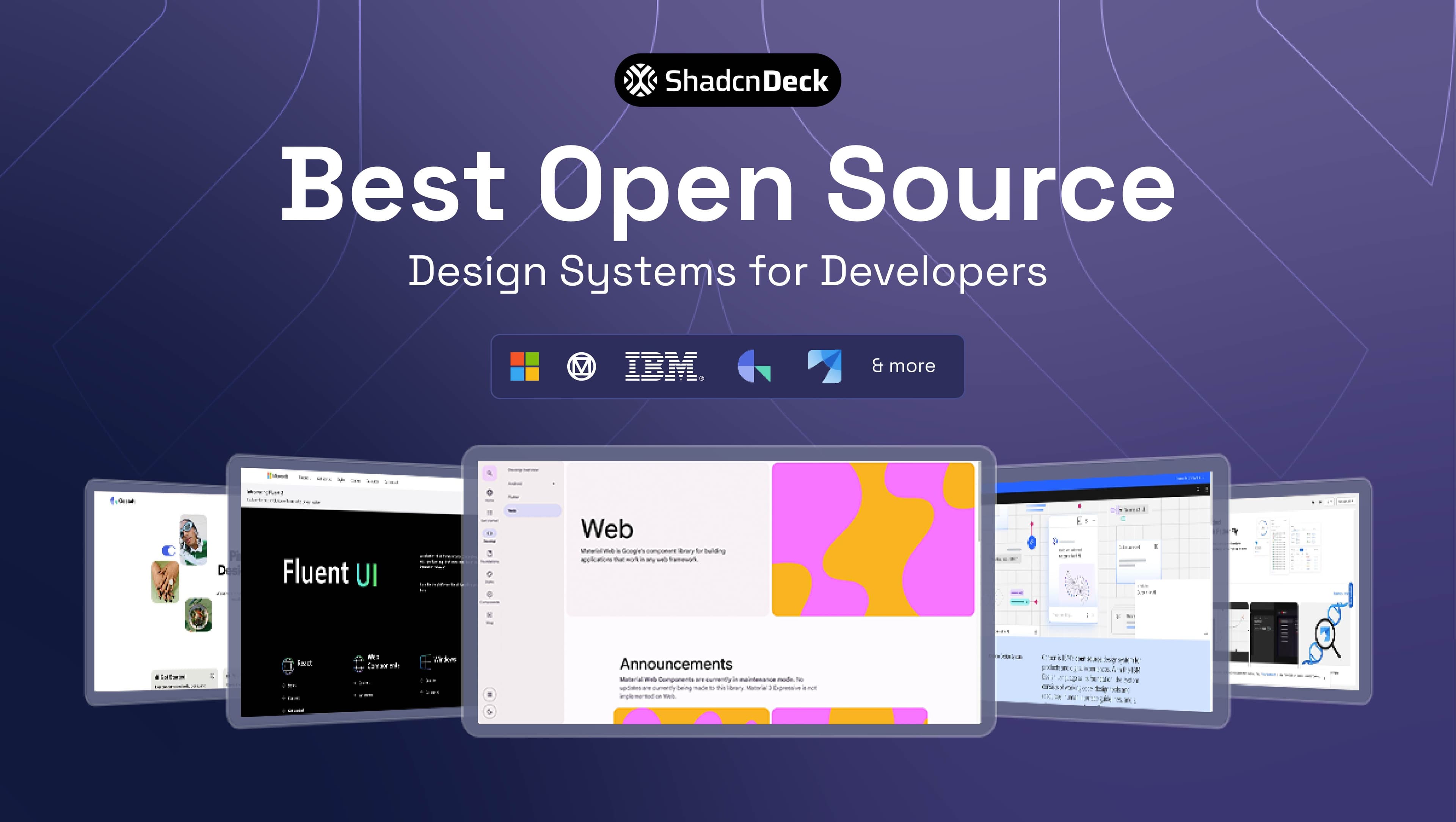
The best open source design systems in 2026 pair a documented token set with production-ready components under a permissive license — shadcn/ui, Ant Design, Fluent UI, and IBM Carbon lead current adoption, each covering a different mix of framework, scale, and accessibility depth. shadcn/ui leads developer adoption specifically, while Carbon and AWS Cloudscape cover the enterprise patterns that consumer-focused systems skip.
That's a narrower claim than "best React UI library," which is worth separating out. Our 17 best React UI libraries in 2026 roundup covers component libraries generally, including several that never publish a documented token system. This guide is scoped to open source UI design systems that actually behave like a design system: tokens, accessibility guidance, and a real contribution model, not just styled buttons.
Ten systems below install from a package manager or CLI, each battle-tested in production at real scale.
Jump to: What counts as open source · Comparison table · Underrated picks · shadcn/ui vs traditional systems · How to choose · FAQ
What makes a design system "open source"?
An open source design system publishes its components, design tokens, and usage rules under a permissive license like MIT or Apache 2.0, so anyone can install, fork, or modify the code without paying a license fee. That's a higher bar than a plain component library, which ships styled code but skips the documented design decisions behind it.
A real design system gives you a type scale, a spacing and color token set, accessibility guidance, and a contribution model — not just a folder of buttons. You inherit years of solved UI problems: focus states, error patterns, contrast ratios, table density. That's the actual value, more than the component count, and it's what separates the best open source design systems from a folder of pre-styled components with a license file attached.
The 7 best open source design systems, compared
These seven combine active maintenance, real production use at scale, and a documented token system rather than just styled components. shadcn/ui, Ant Design, and Fluent UI lead by GitHub star count among the top open source design systems; Cloudscape and Primer lead by production polish relative to their size.
| Design System | GitHub Stars | Framework | Accessible | License |
|---|---|---|---|---|
| shadcn/ui | 124,000+ | React (Radix UI / Base UI) | Yes, via Radix/Base UI primitives | MIT |
| Ant Design | 94,000+ | React | Partial — ARIA support, improving | MIT |
| Microsoft Fluent UI | 20,000+ | React, Web Components | Yes — WCAG 2.1 AA | MIT |
| Material Design 3 | 11,100+ (Material Web) | Web Components, Android, Flutter | Yes | Apache 2.0 |
| IBM Carbon | 9,400+ | React, Web Components, Angular, Vue | Yes — WCAG 2.1 AA | Apache 2.0 |
| GitHub Primer | 3,900+ (React) | React, CSS | Yes | MIT |
| AWS Cloudscape | 2,600+ | React | Yes — WCAG 2.1 AA | Apache 2.0 |
1. shadcn/ui
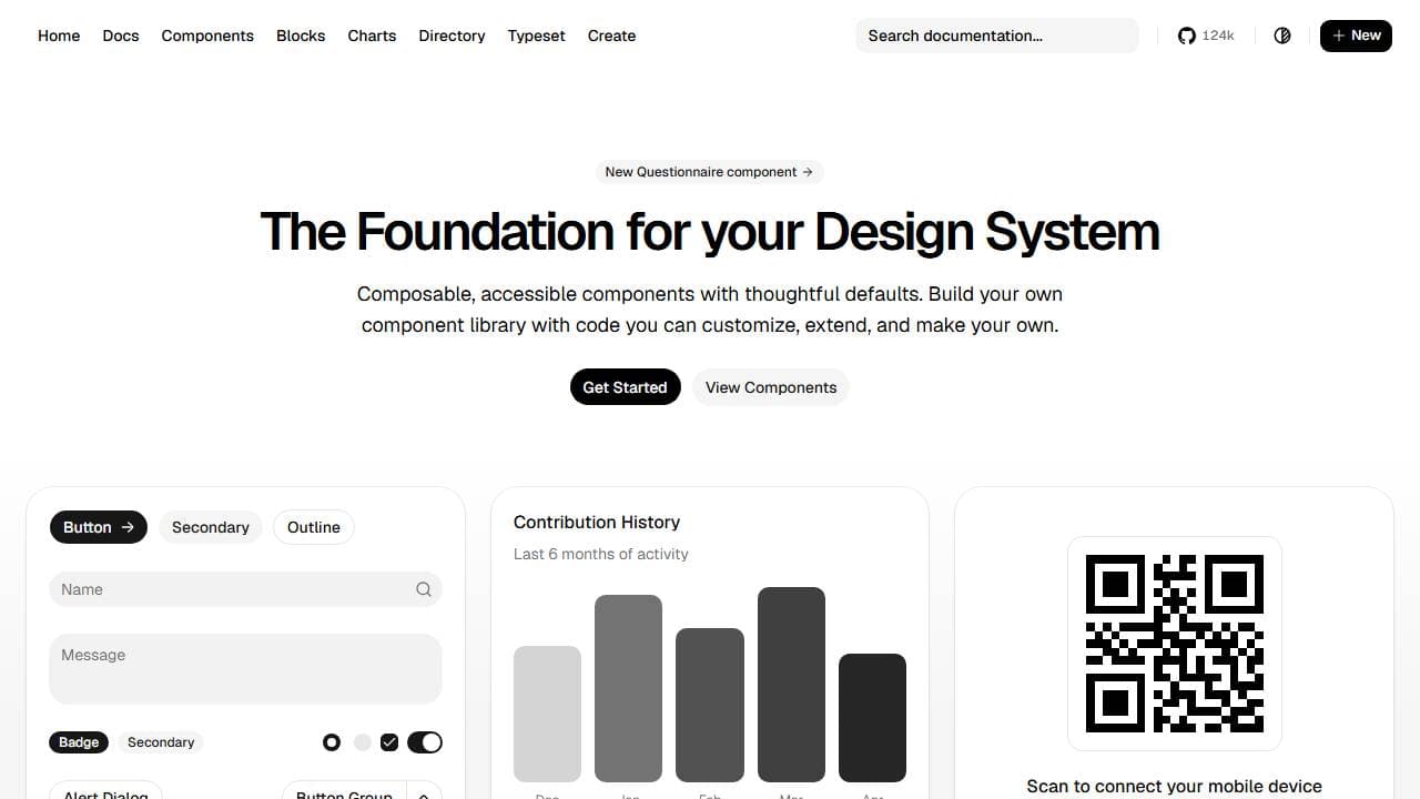
shadcn/ui is not a traditional design system — it copies component source code directly into your project instead of shipping an npm package. You install a component with a single CLI command and own the code from that point forward, with 124,000+ GitHub stars and support for both Radix UI and Base UI as primitive layers. See the official shadcn/ui documentation for the full component catalog.
Key features:
- Copy-paste components — no npm package, no version lock-in
- Works with either Radix UI or Base UI as the accessibility primitive layer
- Tailwind CSS tokens you edit directly, not a runtime theme config
Best for: teams that want full code ownership and a fast Next.js + Tailwind setup.
🦊 Planning to build something on shadcn/ui rather than write it from scratch? Our FoxCopy AI SaaS landing page template ships a hero, how-it-works flow, testimonials, a full blog, and three-tier pricing, all built on shadcn/ui. It's live at launch pricing — $39, down from $79.
2. Ant Design
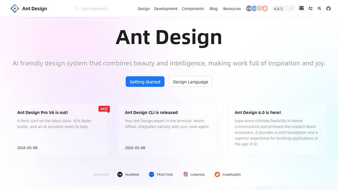
Ant Design is a React design system built by Alibaba, with 94,000+ GitHub stars and dozens of enterprise-grade components. It ships a full theming API based on CSS-in-JS, so a team can rebrand every component from one config file. It fits data-dense admin panels and internal tools best — for a head-to-head against a Tailwind-first alternative, see our Mantine vs shadcn/ui comparison, which covers the same "batteries included vs. code ownership" tradeoff.
Key features:
- Full CSS-in-JS theming API for rebranding every component from one config
- Built-in form validation, i18n, and data-handling utilities
- Deep component set purpose-built for dense tables and multi-step workflows
Best for: internal dashboards and enterprise admin tools.
3. Microsoft Fluent UI
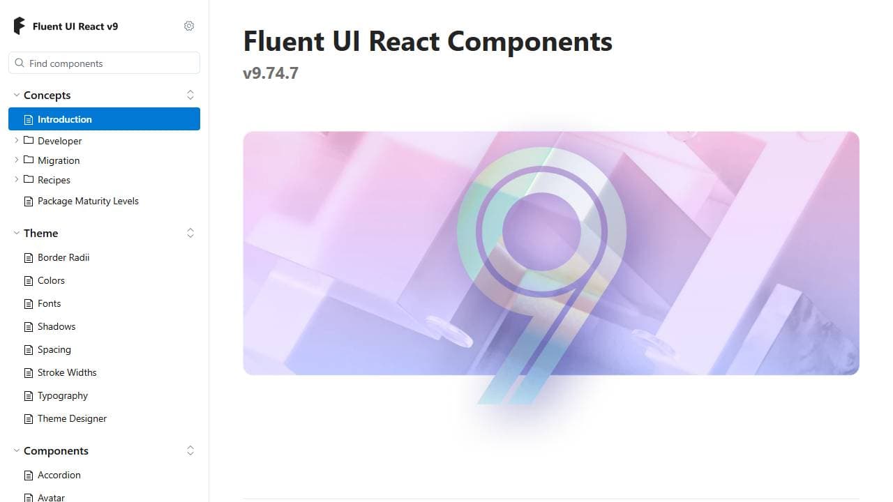
Fluent UI is Microsoft's cross-platform design system, powering Windows, Teams, and Office web apps. It has 20,000+ GitHub stars and ships both React components and framework-agnostic web components. Its tokens map directly to Windows theming, which matters for enterprise software with a Windows-first audience.
Key features:
- Tokens map directly onto native Windows theming
- Ships as both React components and framework-agnostic web components
- Production-tested at Microsoft's own scale across Teams and Office
Best for: enterprise software targeting Windows users.
🎨 Want shadcn/ui's token system without writing it from scratch? The free shadcn theme generator lets you dial in colors, radius, and typography visually, then export the CSS variables straight into your project.
4. Material Design 3 (Material Web)
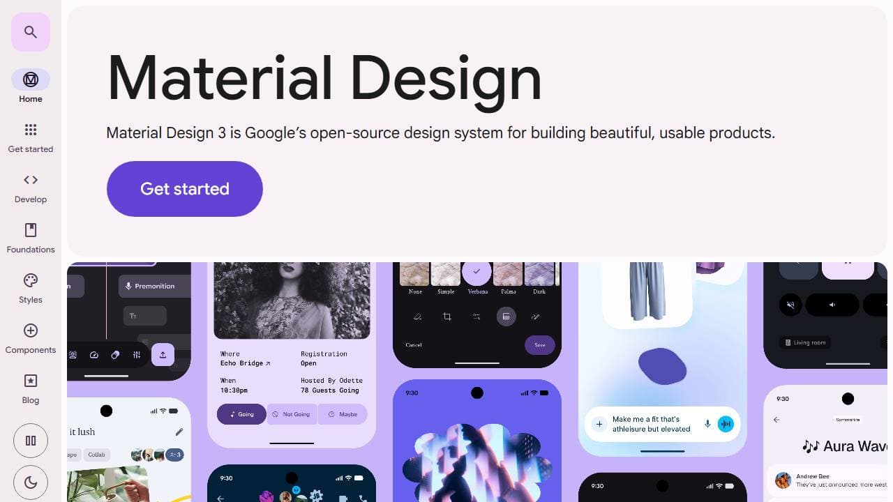
Material Design 3, Google's current design language, ships as Material Web components for the browser alongside native Android and Flutter implementations. The web-components library carries 11,100+ GitHub stars but sits in maintenance mode pending new maintainers. Teams building for Android-first products still get the deepest token coverage from Material 3.
One honest caveat for 2026: Material Web is in maintenance mode. Check for an actively maintained fork before starting a new web project on it — the native Android and Flutter implementations aren't affected.
Key features:
- The deepest Material 3 token coverage of any web implementation
- Shared design language with native Android and Flutter apps
- Web Components — usable from React, Vue, or plain HTML
Best for: cross-platform products that also ship a native Android app.
5. IBM Carbon
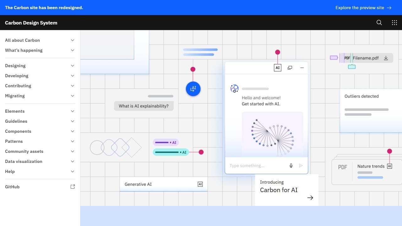
IBM Carbon Design System has 9,400+ GitHub stars and supports React, Angular, Vue, and plain web components from one shared token set. It documents every component against WCAG 2.1 AA, with contrast ratios published alongside each color token. See Carbon's official documentation for the full token reference. It fits large enterprise products that need multi-framework consistency — exactly the scenario where a shared token set outperforms independently styled component libraries per framework.
Key features:
- One token set shared across React, Angular, Vue, and web components
- Every component documented against WCAG 2.1 AA with published contrast ratios
- Active IBM engineering team and a public contribution model
Best for: multi-framework enterprise products.
🎨 Every token comparison in this post is easier with real charts. Our chartcn gallery renders shadcn/ui chart blocks live, already wired to theme tokens — useful if a design system's dashboard components are part of your evaluation.
6. GitHub Primer
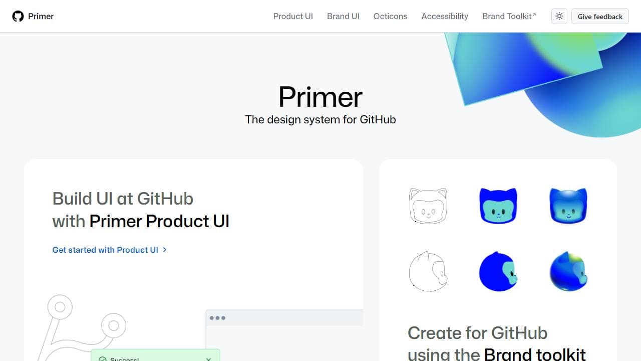
GitHub Primer powers github.com itself, and its React implementation carries 3,900+ GitHub stars. Primer's CSS and React packages ship separately, so a team can adopt just the tokens without the full component layer. Its documentation doubles as a style guide for developer-facing tools.
Key features:
- CSS and React packages ship separately — adopt tokens without the component layer
- Battle-tested at GitHub's own production scale
- Octicons icon set included for developer-tool UI
Best for: developer tools and technical products.
7. AWS Cloudscape
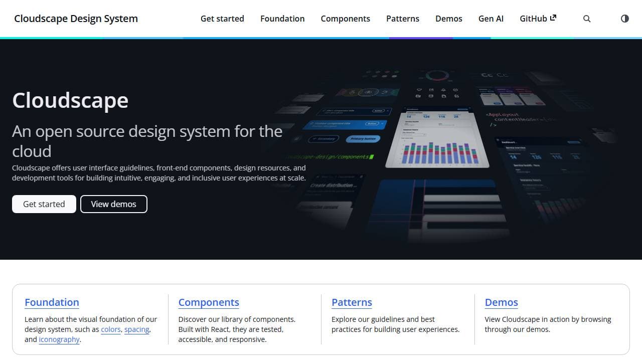
AWS Cloudscape Design System has 2,600+ GitHub stars and powers the AWS Management Console. Its React components package gets 51,000+ weekly npm downloads — high relative to its star count, which signals real production use over GitHub popularity. See Cloudscape's official site for the component APIs. It handles data-dense interfaces like tables, wizards, and dashboards particularly well.
Key features:
- 51,000+ weekly npm downloads against just 2,600+ GitHub stars — real production signal
- Purpose-built patterns for tables, wizards, and dashboards
- Battle-tested inside the AWS Management Console itself
Best for: SaaS dashboards and data-heavy admin interfaces.
3 underrated open source design systems worth trying
These three rarely appear on "best open source design systems" roundups despite real production scale and strong accessibility engineering. Each publishes components under a permissive license with documented tokens, and each solves a problem the seven systems above mostly skip.
8. GOV.UK Design System
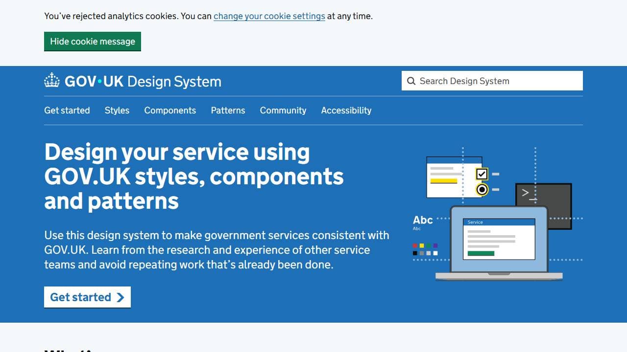
GOV.UK Design System runs under an MIT license and tests every component to WCAG 2.2 AA, the UK government's accessibility bar. Its core repository, govuk-frontend, carries a modest 1,400+ GitHub stars despite powering hundreds of UK government services. It solves hard civic-UI problems — complex forms, address entry, identity verification — that most commercial systems never have to.
Key features:
- Tested to WCAG 2.2 AA, a stricter bar than most commercial systems target
- Battle-tested civic-UI patterns: complex forms, address entry, identity verification
- Powers hundreds of live UK government services today
Best for: teams that need battle-tested, accessible form patterns.
9. Gestalt (Pinterest)
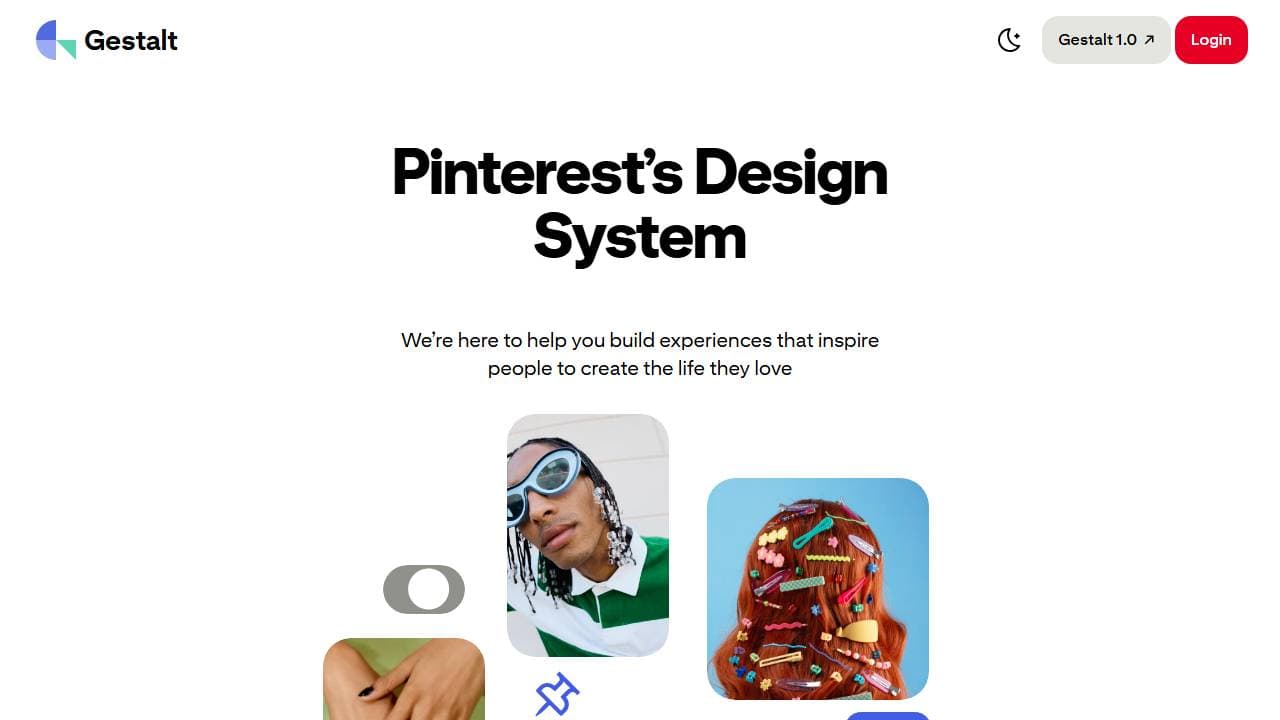
Gestalt is Pinterest's open source design system, sitting at 4,300+ GitHub stars with active commits. A dedicated internal accessibility team maintains its components, pushing Gestalt's accessibility coverage above most consumer-facing systems. It ships as React under an Apache 2.0 license.
Key features:
- Maintained by a dedicated internal accessibility team, not a side project
- Proven at Pinterest's consumer-scale traffic
- Apache 2.0 license with active, ongoing commits
Best for: consumer social or content products that need strong built-in accessibility.
10. PatternFly (Red Hat)
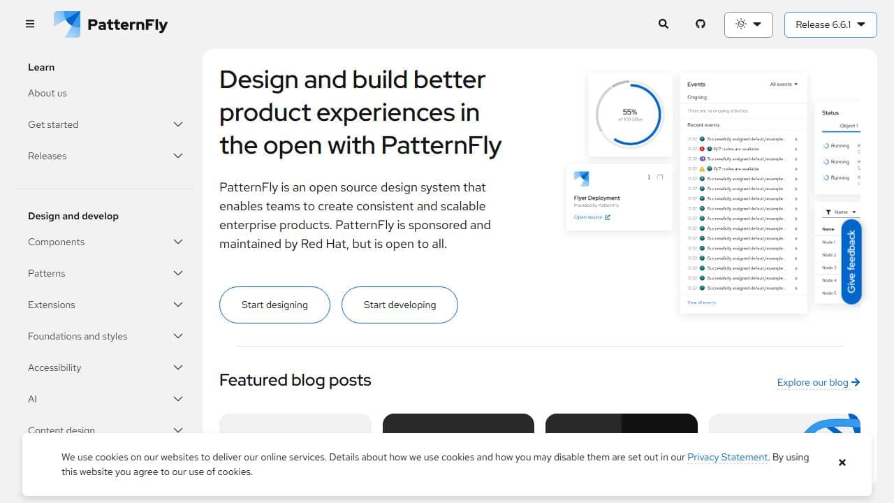
PatternFly powers Red Hat's OpenShift console and much of the Kubernetes tooling ecosystem, under an MIT license. Its React package carries just 856 GitHub stars. Yet @patternfly/react-core alone gets 213,000+ npm downloads a month — a wider stars-to-usage gap than any other system on this list. PatternFly's enterprise adoption stays largely invisible outside DevOps and cloud-infrastructure circles.
Key features:
- 213,000+ monthly npm downloads on just 856 GitHub stars — the widest usage-to-stars gap here
- Powers Red Hat's OpenShift console and the wider Kubernetes tooling ecosystem
- MIT-licensed and open to contributions beyond Red Hat
Best for: developer tooling, infrastructure dashboards, and Kubernetes-adjacent products.
How does shadcn/ui compare to traditional design systems?
shadcn/ui works differently than every other system on this list: it copies component source code into your project instead of shipping an installable package. You own and can rewrite every line, with no version lock-in from an npm dependency.
Traditional systems like Carbon or Ant Design update centrally, so you inherit fixes automatically but lose that direct code ownership. This tradeoff matters most for teams that need heavy customization. A shadcn/ui project often starts from a free shadcn/ui landing page template, then diverges component by component as the product grows. Enterprise systems like Carbon or Cloudscape make more sense when a team needs guaranteed cross-product consistency and can accept the framework's opinions instead — both are among the leading open source design systems for that exact scenario. If you're weighing shadcn/ui against a specific enterprise system rather than the field as a whole, our shadcn/ui vs Material UI breakdown walks through the theming and code-ownership differences in detail.
Getting started takes one command regardless of package manager:
That configures Tailwind CSS variables and a components.json file automatically. Add individual components with npx shadcn@latest add [component] as your product needs them, rather than installing an entire component library upfront — the pattern our shadcn component libraries roundup covers when you outgrow the core set.
How to choose the right open source design system for your project
Match the system to two things: your framework and how much customization you need. Comparing the best UI design systems side by side only helps once you know which axis matters more for your project. A team on Next.js or another React framework that wants full code ownership gets the fastest start from shadcn/ui, since there's no package to version or eject from later. A team spanning Angular, Vue, and React at once needs a token-based system like Carbon or Fluent UI instead, because those tokens stay consistent across frameworks in a way copy-pasted components can't guarantee alone.
Budget and team size matter too. A solo developer or small team benefits most from shadcn/ui's low setup cost and direct code access. A larger organization with a dedicated design team gets more value from Carbon's or Cloudscape's centralized updates, since one team can push accessibility and consistency fixes to every product at once.
- Building a Next.js/React product with Tailwind CSS → shadcn/ui
- Multi-framework enterprise product → IBM Carbon or Fluent UI
- Internal admin dashboard → Ant Design or AWS Cloudscape
- Government or public-sector service → GOV.UK Design System
- Consumer product needing strong accessibility defaults → Gestalt
One practical check regardless of which you pick: look at the repository's commit history before committing to it. A design system with thousands of stars but no commits in six months is a liability — active maintenance matters more than star count for a dependency you'll live with for years. If Radix vs. Base UI is part of that evaluation for a shadcn/ui project specifically, our Radix vs Base UI comparison breaks down the primitive layer underneath shadcn's components.
Related Posts
- 17 best React UI libraries in 2026 - the broader field of component libraries, including several that skip a documented token system
- shadcn/ui vs Material UI - code ownership, bundle size, and theming compared head to head
- Mantine vs shadcn/ui - a batteries-included system against a code-ownership one, on setup speed and long-term maintenance
- Radix vs Base UI - the primitive layer underneath shadcn/ui's components, compared in depth
- 21 shadcn component libraries - where to look once you outgrow shadcn/ui's core component set
- Free shadcn/ui templates - production-ready starting points already built on the shadcn/ui token system
Frequently Asked Questions
Which open source design system should you choose?
That's the shortlist of the best open source design systems in 2026 — but the right pick still depends on your framework and team size, not the ranking. For a Next.js or React project where you want full code ownership and a fast setup, start with shadcn/ui — its 124,000+ GitHub stars reflect current developer adoption, not just longevity. For a multi-framework enterprise product where centralized updates matter more than customization, IBM Carbon or AWS Cloudscape are the safer bet. GOV.UK Design System, Gestalt, and PatternFly all outperform their GitHub star counts in real production usage — worth a look specifically because they're not on every "best of" list already.
Every system here ships under MIT or Apache 2.0, so the license isn't the deciding factor. What decides it is whether you want to own the code or inherit the updates — browse ShadcnDeck's template library if you've landed on shadcn/ui and want to skip the setup step entirely.