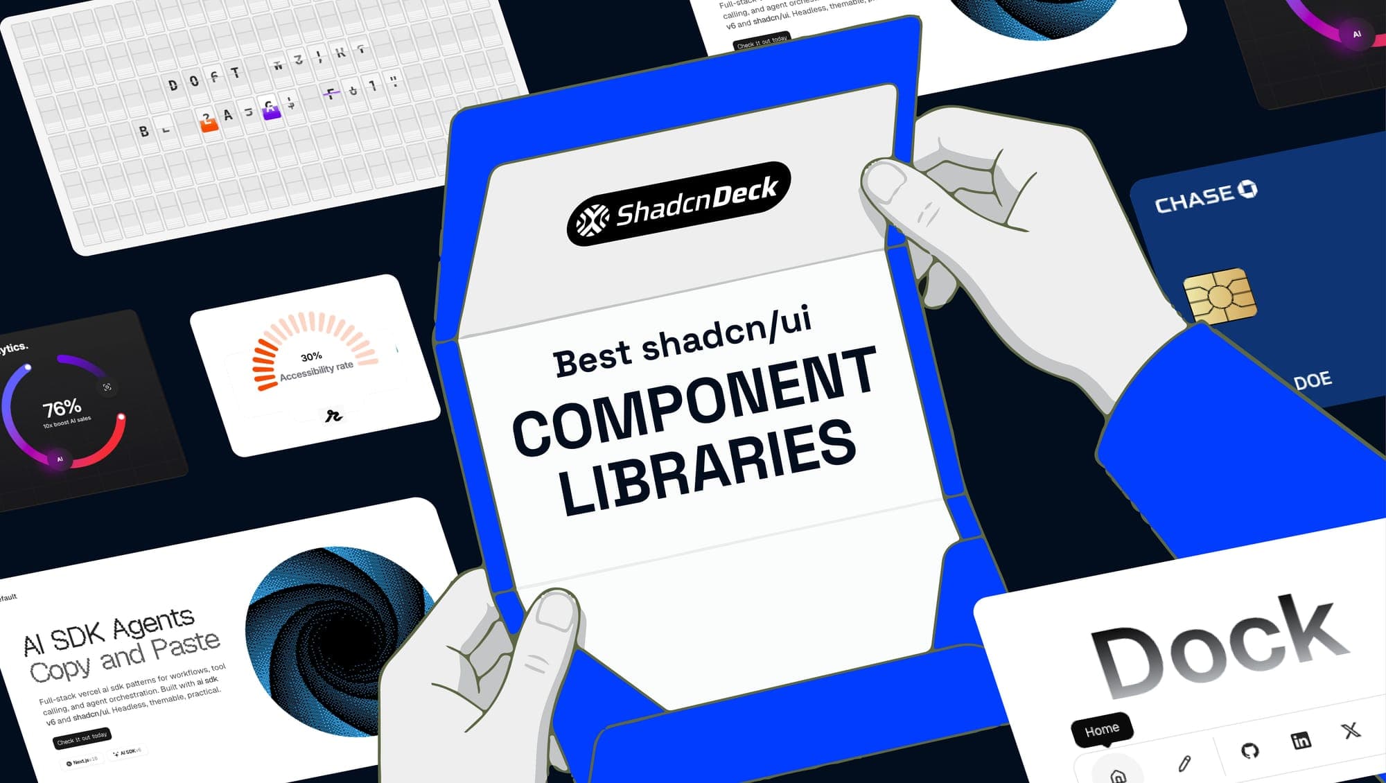
The best shadcn component libraries in 2026 extend shadcn/ui with animations, advanced primitives, marketing blocks, dashboard components, and AI UI patterns, all installable via the shadcn CLI with no vendor lock-in. This list covers 21 open source shadcn libraries, from Magic UI's 150+ animated components to Kibo UI's Gantt charts and Kanban boards, so you can pick exactly which shadcn ui extensions your project needs.
Each entry below shows what the library ships, its GitHub star count, what makes it unique, and an installation command. If you want to skip the research entirely, ShadcnDeck's landing page templates give you a production-ready shadcn/ui project in minutes.
Why extend shadcn/ui with a component library?
shadcn/ui ships around 50 core primitives: buttons, dialogs, inputs, and navigation. Those cover the foundation. But most production projects need more, like animated hero sections, Gantt charts, WYSIWYG editors, or AI chat interfaces. That is exactly what these shadcn component libraries solve.
The key difference from a traditional npm package is ownership. Every shadcn ui component library below follows the copy-paste model, so components land as source files in your /components folder. You own the code, you modify it freely, and there is no version to bump or peer dependency tree to manage. If you want the backstory, how shadcn/ui became the default React stack explains why this approach won.
In 2026, the shadcn CLI supports multiple registries directly, so npx shadcn add @magicui/magic-card works the same way npx shadcn add button does. The ecosystem has matured into a proper extension layer, and these open source shadcn libraries are the best of it.
The 21 best shadcn component libraries in 2026
Here are the 21 best shadcn libraries in 2026, grouped loosely by what they add: animations, marketing blocks, advanced app components, charts, and speciality use cases. Every one is a genuine shadcn ui extension that plugs into your existing design tokens.
1. Magic UI
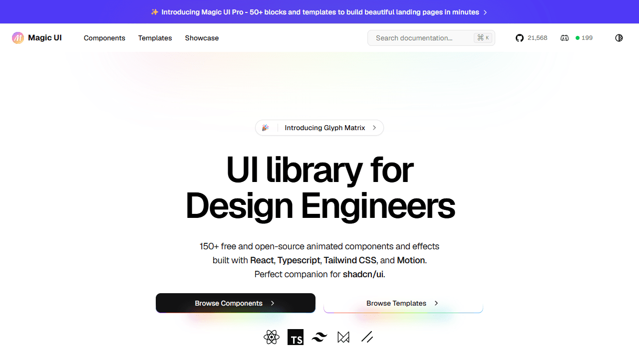
Magic UI is the most widely used animation layer in the shadcn ecosystem, with 21,000+ GitHub stars. It ships 150+ free, open source animated components built with React, TypeScript, Tailwind CSS, and Motion (formerly Framer Motion): animated beams, bento grids, marquees, retro grids, shimmer buttons, and text effects, all designed to drop straight into a shadcn/ui codebase.
Why it's unique: Magic UI is the default choice for marketing pages and SaaS landing pages that need polish without heavy custom animation work. It pairs with shadcn/ui's core primitives rather than replacing them, and most components install via the shadcn CLI with a single command.
- Best for: SaaS landing pages, marketing sites, hero sections, first-impression visual quality
- Components: 150+ animated components
- Licence: MIT, free
2. Aceternity UI
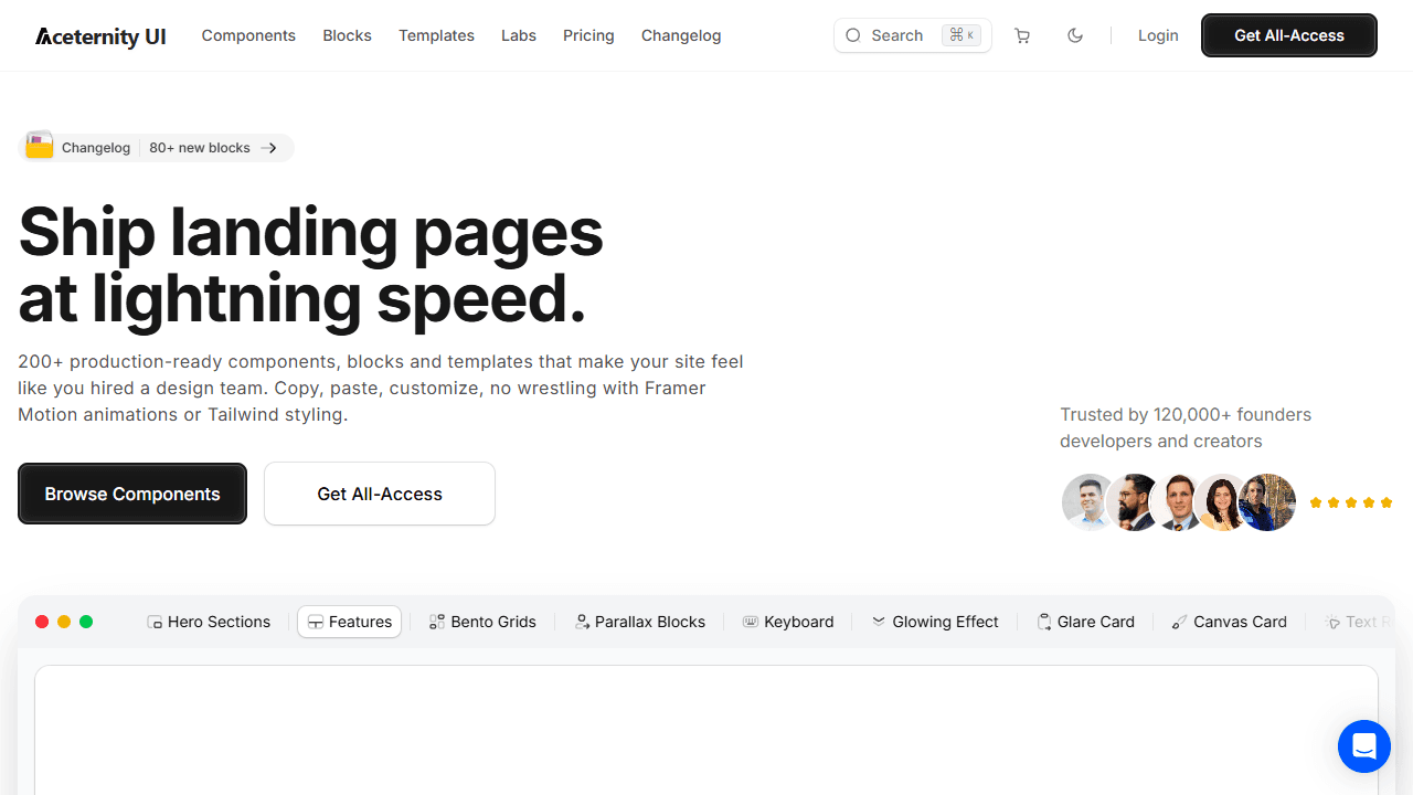
Aceternity UI is the boldest visual effects library among shadcn component libraries. It specialises in 3D cards, glowing beams, spotlight effects, magnetic buttons, and particle backgrounds, all built with Tailwind CSS and Framer Motion. The library ships 200+ components and blocks, trusted by 120,000+ founders and developers, with a free core tier and a paid all-access pass.
Why it's unique: Where Magic UI focuses on polished micro-interactions, Aceternity goes for cinematic impact. Its effects make landing pages feel custom-designed by an in-house team, which is why it has become a default choice for developer-tool SaaS and AI product landing pages that need to stand out.
- Best for: High-impact hero sections, SaaS product pages, UI that needs to feel designed
- Components: 200+ components and blocks
- Licence: Free core plus paid all-access pass
3. Motion Primitives
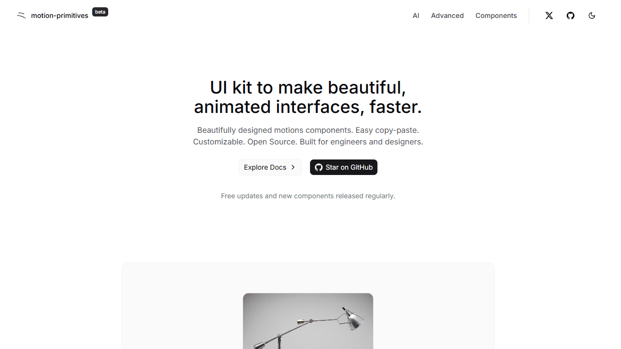
Motion Primitives is a UI kit for building beautiful, animated interfaces faster. It offers 50+ animation components built with Motion and Tailwind CSS: animated carousels, text effects, page transitions, scroll-triggered reveals, and interactive micro-interactions. It is an official shadcn registry, so components install via npx shadcn add.
Why it's unique: Motion Primitives sits between Aceternity (flashy) and plain shadcn/ui (static). The animations are subtler and more production-appropriate, closer to what you would see in a Vercel or Linear product. It is the right choice when you want polish without theatrics.
If the one effect you need is a line drawing itself, you may not need a kit at all. Animating Motion's pathLength on each pen stroke gets you a self-drawing signature in one small component.
- Best for: Product interfaces, dashboards, and SaaS apps that need refined animation
- Components: 50+ animated components
- Licence: MIT, free
4. Shadcnspace
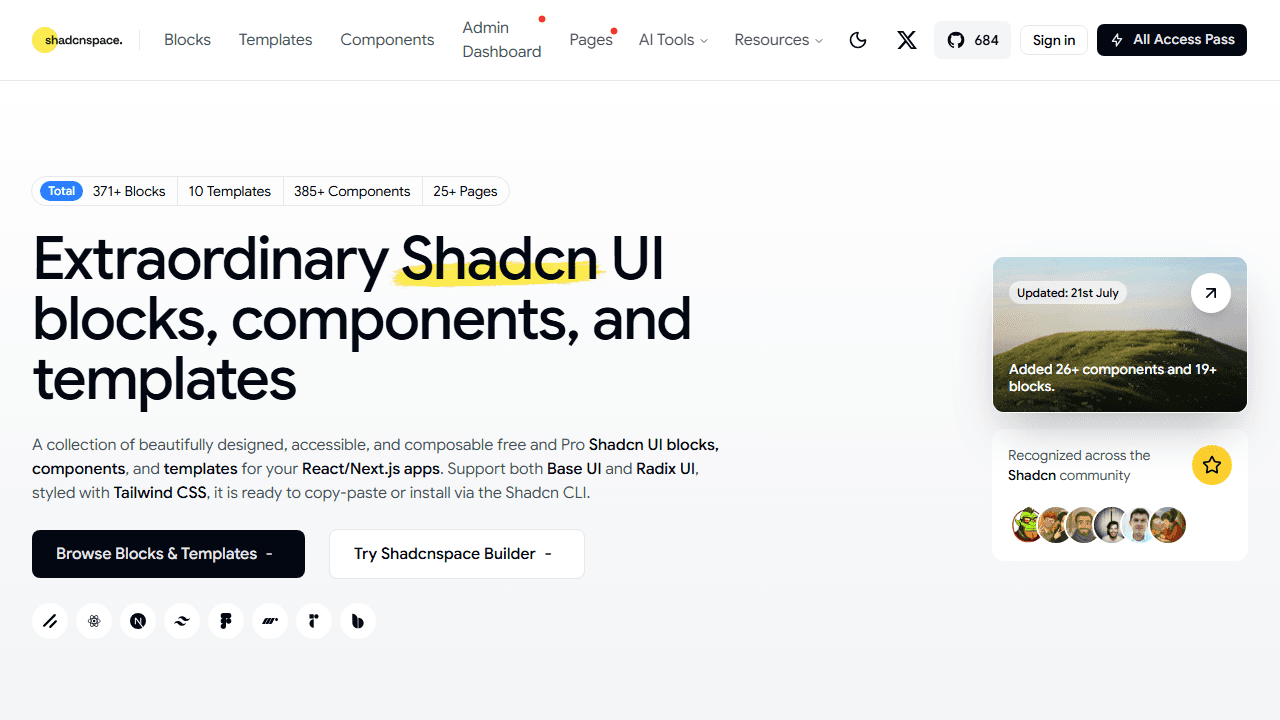
Shadcnspace is a large block and component registry for shadcn/ui from WrapPixel, shipping 371+ blocks, 385+ components, 25+ full pages, and 10 templates for React and Next.js apps. Its open source core has 700+ GitHub stars, it supports both Radix UI and Base UI, and it adds an interactive Shadcnspace Builder plus a Figma UI kit with 100+ components for teams that want a design-to-code workflow.
Why it's unique: Shadcnspace pairs Shadcnblocks-style volume with an MCP server, so AI coding agents can browse and generate its blocks directly inside an IDE. The free MIT-licensed tier alone covers most marketing and dashboard sections, and the paid templates carry a one-time price with no recurring fee, which is rarer among the block marketplaces in this list.
- Best for: Agencies and solo developers who want a large free block library plus optional premium templates
- Components: 371+ blocks, 385+ components, 25+ pages, 10 templates
- Licence: MIT free core, one-time paid Pro templates
5. Cult UI
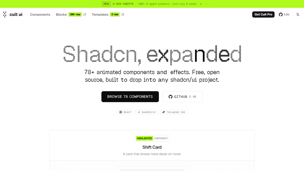
Cult UI is a curated set of animated shadcn-style components with 5.9k GitHub stars and a strong focus on AI and agentic UI patterns. It ships 78+ animated components and effects, including streaming text, agent thought chains, human-in-the-loop approval cards, Gemini-style image editors, and expandable chat toolbars, plus a growing set of copy-and-paste AI SDK agent patterns.
Why it's unique: Cult UI is one of the only shadcn component libraries explicitly designed for AI product interfaces in 2026. Where most libraries assume a traditional SaaS or marketing context, Cult UI assumes you are building a chat app, agent dashboard, or AI-native product. The Toolbar Expandable component alone is worth exploring if your product has a chat input.
- Best for: AI startups, agent dashboards, chat interfaces, agentic UI patterns
- Components: 78+ animated components and effects
- Licence: MIT, free
6. Shadcnblocks
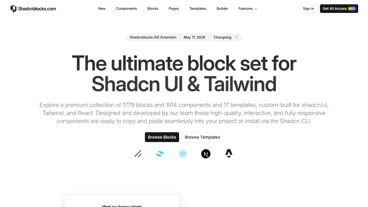
Shadcnblocks is the most comprehensive block marketplace among shadcn component libraries. It ships 1,700+ premium blocks and 1,900+ components across 17 templates, covering hero sections, pricing tables, dashboards, feature grids, testimonials, navbars, and footers. It includes 150+ free blocks, a full Figma kit, and one of the best developer browsing experiences in the ecosystem.
Why it's unique: Shadcnblocks wins on breadth and workflow. Browsing, previewing, and installing blocks is faster here than anywhere else, and the Figma-to-code path is the strongest in its category. If you need volume and a single source of truth for page sections, this is the shadcn ui component library to start with.
- Best for: Freelancers and agencies building marketing sites or SaaS landing pages
- Components: 1,700+ blocks (150+ free)
- Licence: Freemium
7. Tailark
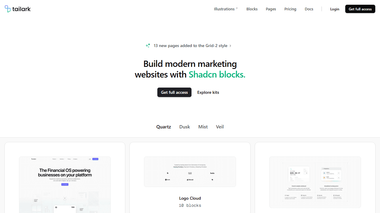
Tailark is a marketing-focused block library with the most distinctive design language among shadcn component libraries. It ships 300+ marketing blocks (hero sections, feature highlights, pricing tables, testimonials, FAQ, footers, and CTAs) across four cohesive themes: Quartz, Dusk, Mist, and Veil. The aesthetic is bespoke, not the generic shadcn look.
Why it's unique: Tailark solves a specific problem, which is that your landing page looks like every other shadcn-built SaaS. Its four themes give pages a visual identity that feels designed, not assembled. If Shadcnblocks is the Swiss Army knife, Tailark is the specialist tool for high-end marketing sites.
- Best for: Startups and product teams who want a landing page that stands out
- Components: 300+ marketing blocks
- Licence: Freemium
8. 21st.dev
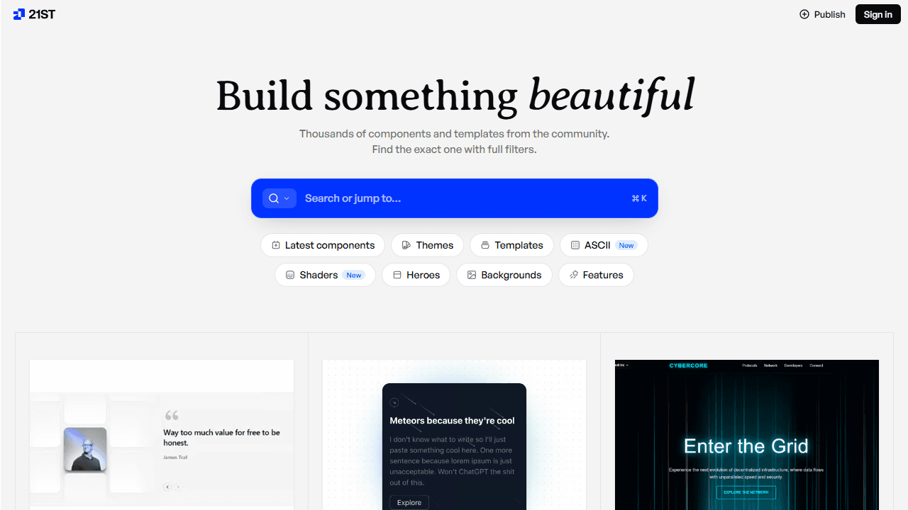
21st.dev is a community-driven open registry and marketplace for shadcn-compatible components, blocks, and hooks. It lets developers publish their own components and install community-made ones via the shadcn CLI, positioning itself as "npm for design engineers" with thousands of components, themes, and full-page templates.
Why it's unique: 21st.dev is one of the few shadcn component libraries where the content is community-sourced. Instead of one team's design decisions, you get contributions from hundreds of developers, so the variety is unmatched and you can find niche components no other library ships. It also integrates with AI coding tools directly.
- Best for: Maximum variety, niche patterns, contributing your own components back
- Components: Open registry, thousands of community components
- Licence: Freemium (free to install, paid publishing features)
9. Kibo UI
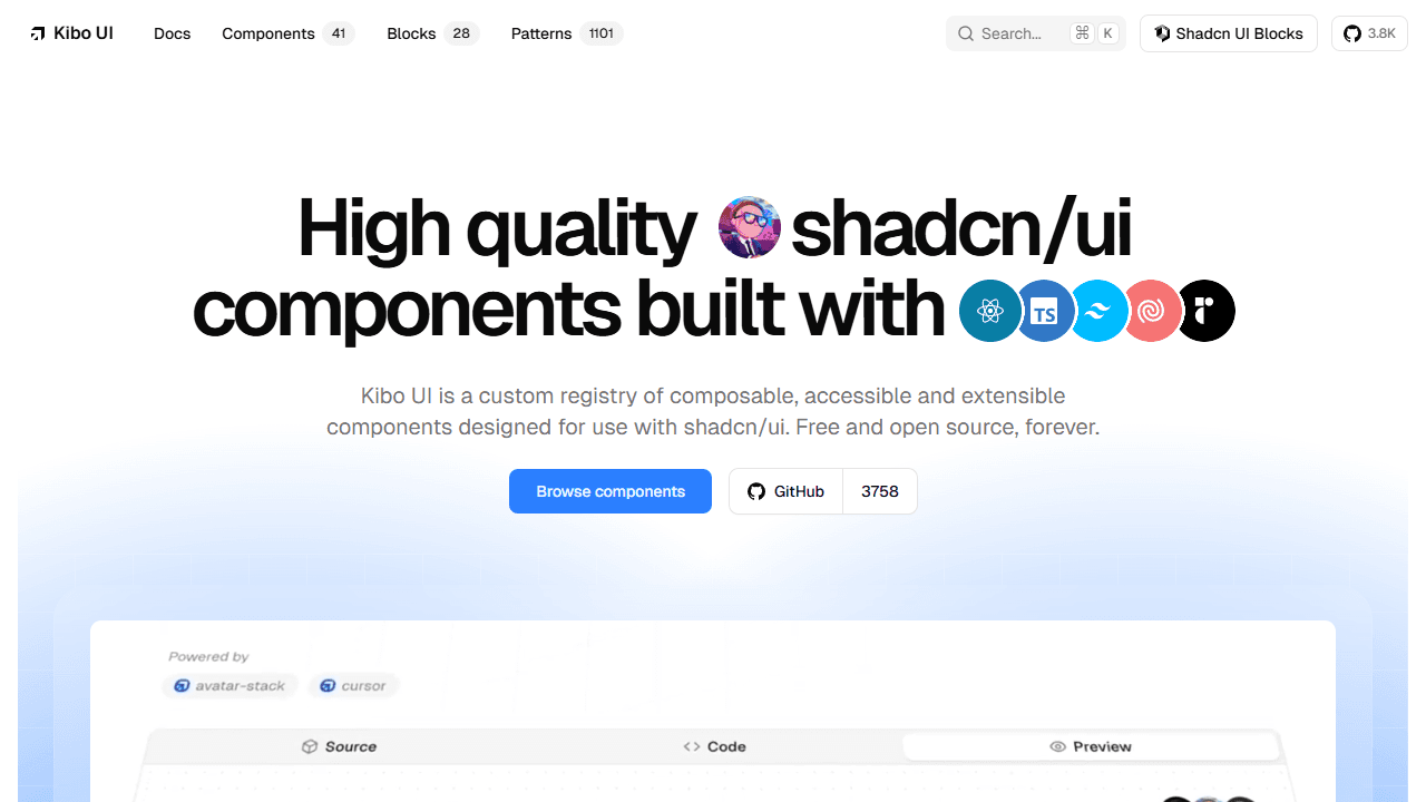
Kibo UI is a custom registry of composable, accessible, open source components for shadcn/ui, specifically the complex, stateful components shadcn/ui does not ship. It covers Gantt charts, Kanban boards, a rich-text code editor, AI chat elements, a colour picker, and a file dropzone, spread across 40+ components and 1,000+ patterns. Every component uses shadcn's CSS variables and integrates cleanly with existing primitives. If a Kanban board is the only piece you need, building one directly on dnd-kit is around a hundred lines and avoids adopting a whole registry for it.
Why it's unique: Kibo UI picks up exactly where shadcn/ui stops. Most shadcn component libraries add visual flair; Kibo UI adds functional complexity, the kind of components most teams would otherwise spend weeks building from scratch. It is the right choice for SaaS apps, internal tools, and dashboards that need real business logic.
- Best for: SaaS dashboards, internal tools, project management apps
- Components: 40+ complex components plus 1,000+ patterns
- Licence: MIT, free
10. Origin UI
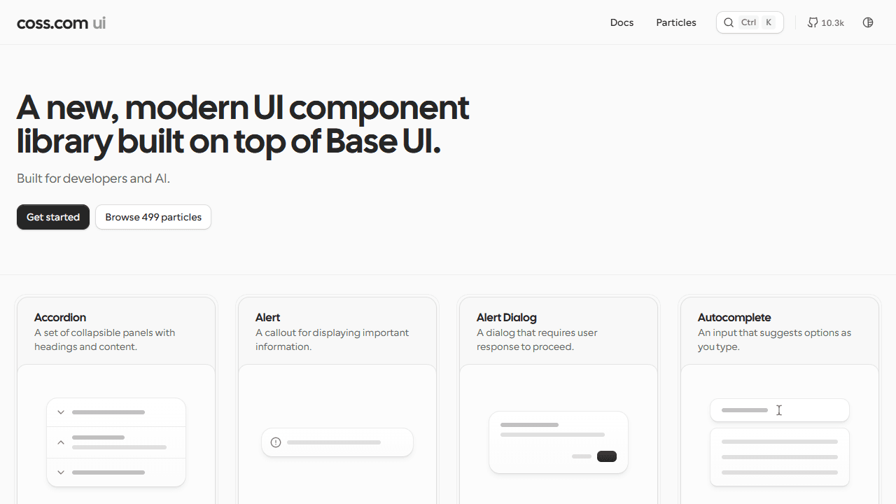
Origin UI is a shadcn-compatible library of 484 advanced "particles": copy-paste components including timelines, rich dialogs, custom inputs, autocomplete, and many patterns that shadcn/ui does not officially ship. It supports both Radix UI and Base UI and is fully Tailwind v4 compatible, backed by a large and trusting community.
Why it's unique: Origin UI fills the gap between shadcn/ui's core primitives and full application complexity. It does not add animations or marketing blocks; it extends the primitive layer, giving you a richer input vocabulary and more complex interactive patterns, all in the shadcn style.
- Best for: Application UIs, form-heavy products, more primitive variety
- Components: 484 components
- Licence: MIT, free
11. ReUI
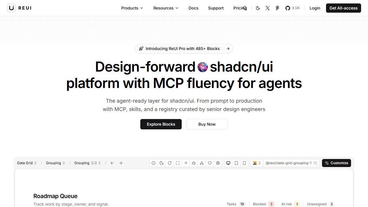
ReUI claims to be one of the largest free open source shadcn component collections, shipping 1,000+ components across 60+ categories. It supports both Radix UI and Base UI, making it one of the only shadcn ui component libraries with genuine dual-primitive support. Categories include data grids, file uploads, Kanban boards, charts, tables, widgets, and advanced forms, plus a free MCP server for AI coding agents.
Why it's unique: Scope is the selling point. ReUI covers more ground than almost any other single free library in this list, and its dual Radix plus Base UI support makes it more future-proof as the shadcn ecosystem shifts toward Base UI in 2026.
- Best for: SaaS applications and internal tools that want the widest free coverage
- Components: 1,000+ free components
- Licence: Free (Pro tier available)
12. shadcn/ui Charts
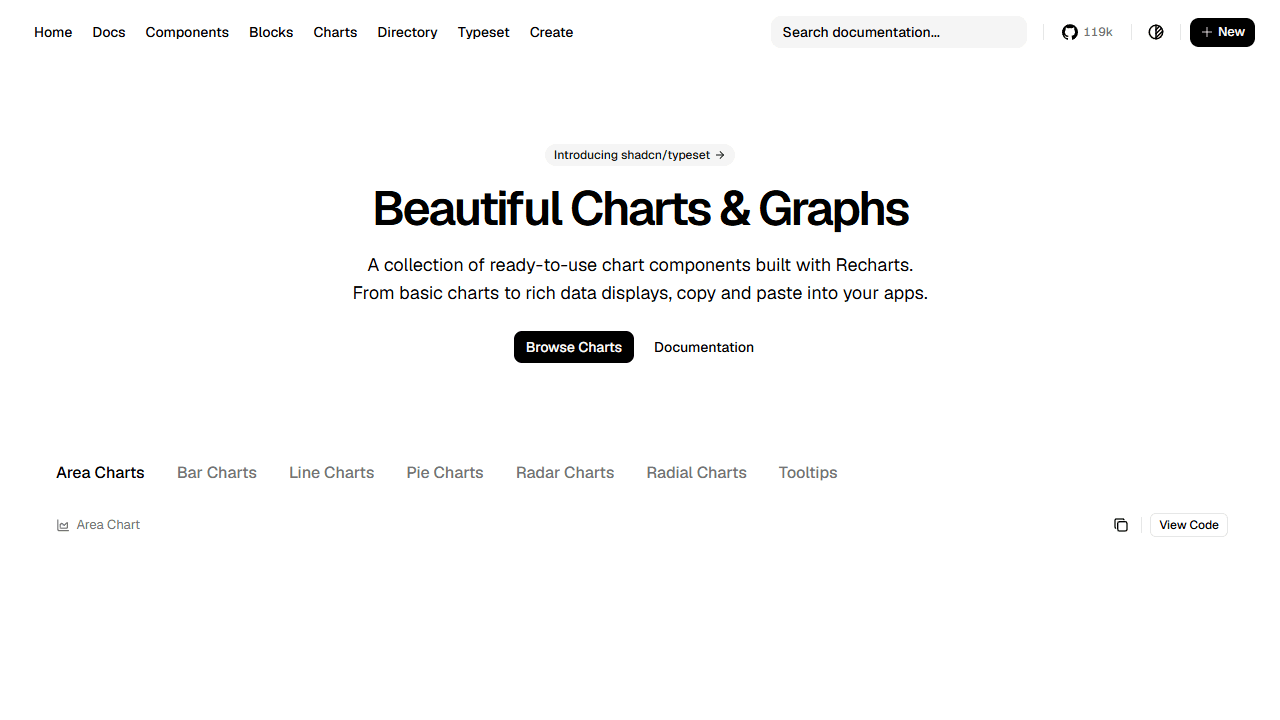
shadcn/ui Charts is the official chart layer built directly into shadcn/ui (119k+ GitHub stars), powered by Recharts and themed via shadcn's CSS variable system. It ships 11+ chart types: area, bar, line, pie, donut, radar, and KPI cards, all fully accessible, responsive, and customisable via the standard shadcn theme.
Why it's unique: It is the only charting option in this list that is part of the official shadcn/ui project itself, which means zero compatibility concerns and guaranteed theme consistency. For a full walkthrough with live previews, see our shadcn charts guide with 11 creative variants, or browse the themed chart gallery to compare the bar, line, area, pie, and radar families side by side.
- Best for: Any shadcn/ui project that needs charts: dashboards, analytics, reporting
- Components: 11+ chart types
- Licence: MIT, free
13. MynaUI
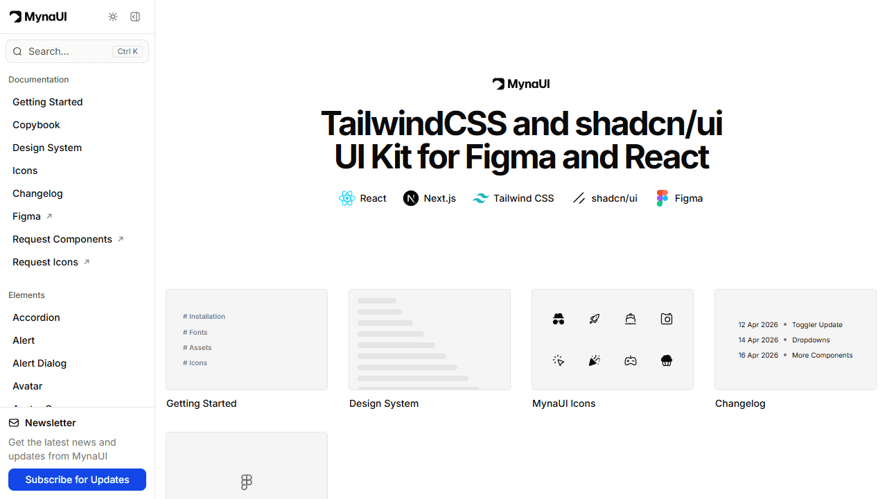
MynaUI is a design-systems-first shadcn component library. It ships a free Tailwind and shadcn/ui React component kit matched to a full Figma design system, giving teams a direct design-to-code workflow. Components cover the full shadcn/ui range with additional variants, and the Figma kit maintains pixel-accurate parity with the React implementation.
Why it's unique: MynaUI is the strongest choice for teams where design and engineering need to stay in sync. The Figma kit is not an afterthought, it is a core part of the product, which removes the usual friction between design files and shipped components.
- Best for: Product teams with designers, agencies running design-to-code workflows
- Components: 100+ components
- Licence: Freemium
14. Kokonut UI
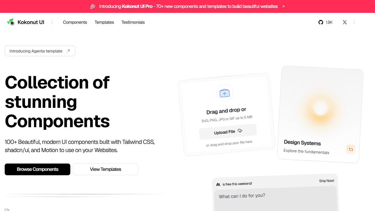
Kokonut UI is an animated marketing component library built on Tailwind CSS v4, Radix UI, and shadcn/ui conventions. It focuses on interaction-driven interfaces and marketing layouts: animated buttons, hero sections, feature cards, pricing components, and interactive forms, commonly used in SaaS landing pages alongside shadcn/ui's core primitives.
Why it's unique: Kokonut UI is fully free, which separates it from Tailark and Shadcnblocks on the marketing-block side. It also ships with Tailwind v4 support from the start, making it one of the more forward-compatible open source shadcn libraries for teams already on v4.
- Best for: Indie hackers and small teams building SaaS landing pages
- Components: 50+ components
- Licence: Free
15. 8bitcn
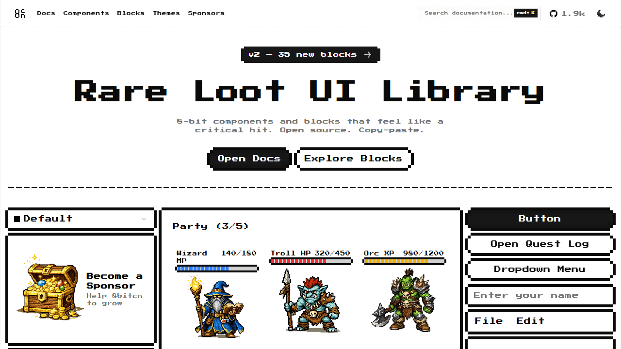
8bitcn is a retro, pixel-aesthetic component library built on the shadcn/ui structure, with 1.9k GitHub stars and a "Rare Loot" 8-bit design language: pixelated borders, retro typography, and gamepad-inspired UI elements, all while preserving Radix UI accessibility underneath. It is built with React, TypeScript, and Tailwind v4.
Why it's unique: It is one of the only shadcn component libraries with a completely distinct aesthetic identity. Nearly every other library builds on the clean shadcn visual language; 8bitcn breaks from that entirely. For games, creative tools, dev portfolios, or products with a niche retro brand, nothing else comes close.
- Best for: Game projects, retro-themed apps, developer portfolios
- Components: 35+ components and blocks
- Licence: MIT, free
16. Animate UI
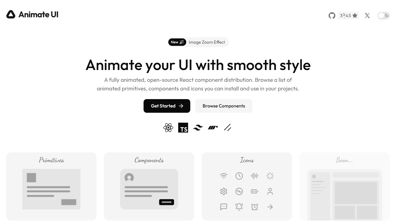
Animate UI is an open source component distribution that animates shadcn/ui's own primitives (accordion, checkbox, dialog, sheet, and more) using Motion, while keeping Radix UI's accessibility intact. It also ships additional animated elements like text effects and background transitions, all installable via the shadcn CLI.
Why it's unique: Animate UI solves a specific gap. Magic UI and Aceternity add new components; Animate UI upgrades the components you already have. If your shadcn accordion feels static and you want smooth open and close transitions without breaking keyboard navigation, Animate UI is the direct answer.
- Best for: Existing shadcn/ui codebases that want animation without a rebuild
- Components: 40+ animated primitives and effects
- Licence: MIT, free
17. Skiper UI
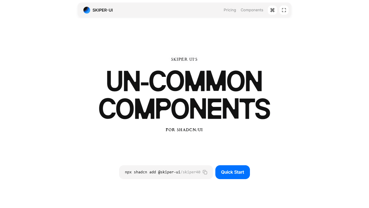
Skiper UI is a Next.js component library of "un-common components" for shadcn/ui. It focuses on components you would not find in the standard shadcn/ui or most extension libraries: unusual interaction patterns, creative input components, and distinctive UI elements. It ships 24+ free and 54+ premium components, each as a single self-contained file installable via the shadcn CLI.
Why it's unique: The editorial angle is the differentiator. Rather than shipping more hero sections or another animated button, Skiper UI curates components developers rarely find pre-built: creative hover states, unusual navigation, and interaction-heavy elements. It also ships an MCP server so AI coding tools get full docs and patterns automatically.
- Best for: Developers who need unusual, high-quality components with personality
- Components: 24+ free, 54+ premium
- Licence: Free plus one-time paid tier
18. Tremor
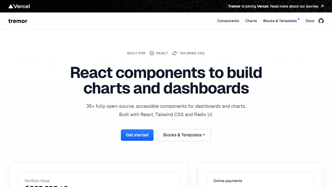
Tremor is a free, open source React component library focused on dashboards, analytics tools, and data-heavy interfaces. It ships 35+ components (area charts, bar charts, KPI cards, donut charts, filter controls, and data tables) built with React, Tailwind CSS, and Radix UI. With 16k+ GitHub stars and over a million weekly npm downloads, it is the most widely adopted dashboard-specific library in the React ecosystem, and Tremor is now joining Vercel.
Why it's unique: Tremor specialises where shadcn/ui is weakest. shadcn/ui gives you a great table primitive; Tremor gives you sortable, filterable, paginated data grids with chart overlays and KPI cards, production-ready, in one library. It is fully shadcn-compatible and installs cleanly alongside it. If you would rather stay on the primitive, composing sorting and pagination onto it with TanStack Table takes about a hundred lines and keeps the dependency count at one.
- Best for: Analytics dashboards, SaaS admin panels, reporting tools
- Components: 35+ dashboard and chart components
- Licence: MIT, free (premium blocks available)
19. Novel
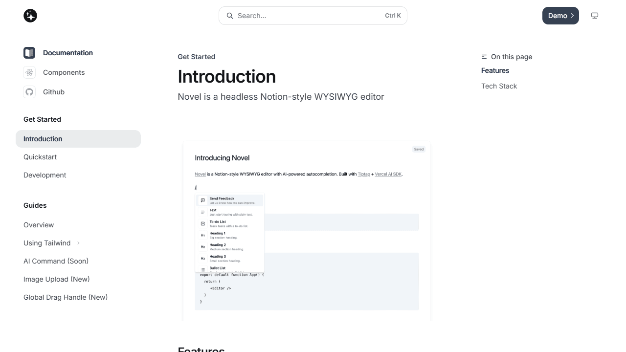
Novel is an open source, Notion-style WYSIWYG rich-text editor for React, styled to match shadcn/ui and built with Tiptap under the hood. It adds AI-powered autocompletion via the Vercel AI SDK, is copy-paste compatible and MIT-licensed, and integrates naturally with any shadcn/ui project's colour system and typography scale.
Why it's unique: No other shadcn component library covers the content-editing use case. Novel is the go-to answer when your product needs a rich text editor (blog platforms, note-taking apps, document tools, onboarding flows) and you want it to look native to your shadcn/ui design system rather than like an embedded third-party widget.
- Best for: Blogs, documentation tools, CMS interfaces, user-generated content
- Components: 1 editor with an extensive plugin architecture
- Licence: MIT, free
20. assistant-ui
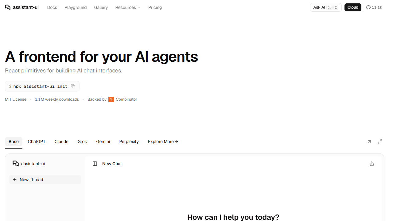
assistant-ui is an open source React component library for building AI chat interfaces, fully compatible with shadcn/ui's design system. It ships composable chat components (message threads, streaming text, tool call displays, human-in-the-loop steps, and model switchers) with broad LLM provider support including OpenAI, Anthropic, and the Vercel AI SDK. It has 11k+ GitHub stars and over a million weekly downloads, and is MIT-licensed.
Why it's unique: With AI assistants now a standard SaaS feature, assistant-ui is one of the only shadcn component libraries built specifically for that surface. It handles the hard parts (streaming, message state, tool call rendering) and plugs into your existing shadcn/ui theme. Pair it with Cult UI's agentic patterns for a complete AI product UI kit.
- Best for: SaaS products with embedded AI assistants, chatbot interfaces
- Components: 20+ composable AI chat components
- Licence: MIT, free
21. Neobrutalism Components
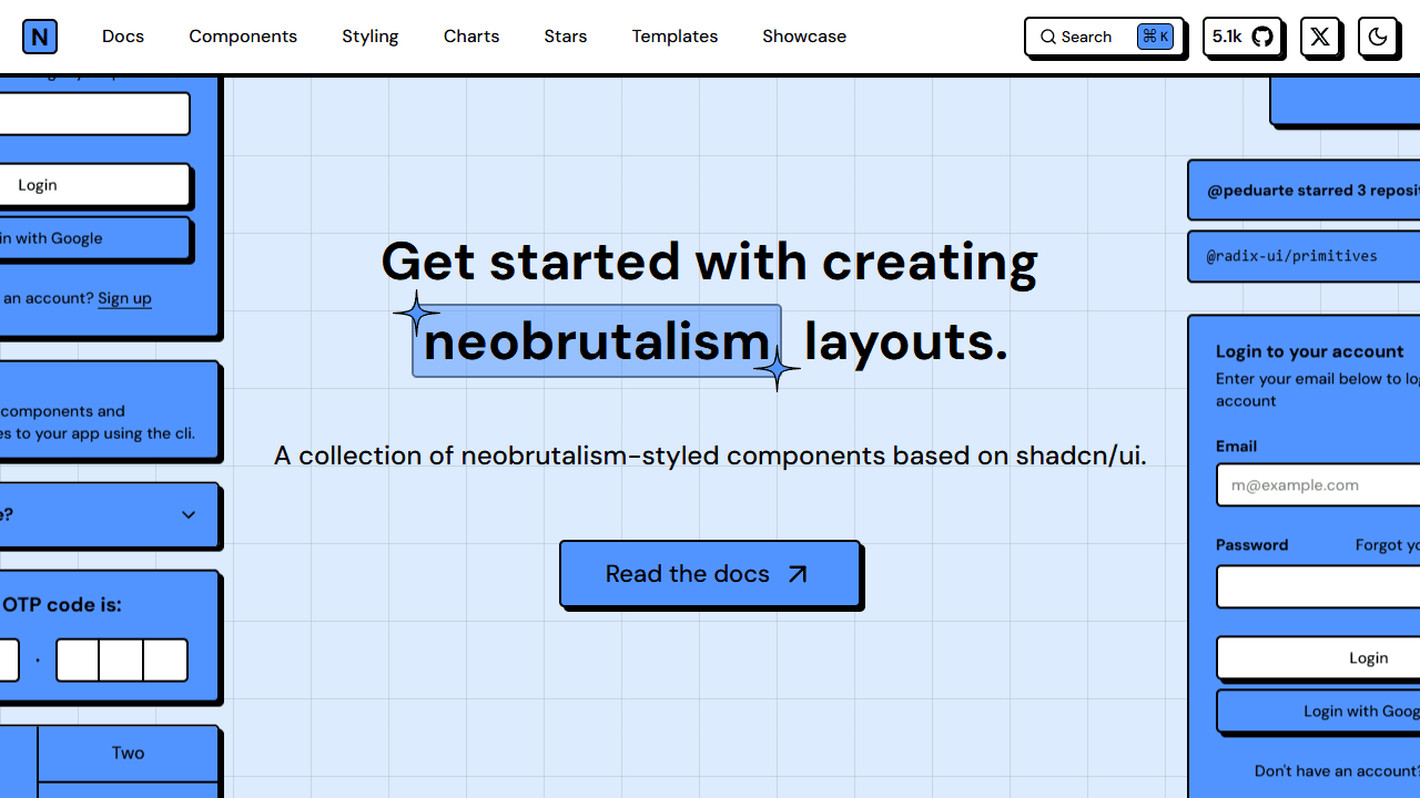
Neobrutalism Components is a collection of neobrutalism-styled React components built directly on top of shadcn/ui, with 5.2k GitHub stars and active maintenance into 2026. It applies a consistent neobrutalism design language (high-contrast colours, heavy borders, zero border-radius, strong geometric shapes, and deliberate flatness) and every component is MIT-licensed and copy-paste installable.
Why it's unique: Neobrutalism is the one major web-UI aesthetic that actively rejects the polished SaaS look, and this library executes it cleanly on top of shadcn. For products targeting developers or creative communities, it delivers a strong visual identity that no amount of theme customisation on standard shadcn can replicate.
- Best for: Developer-targeted products, creative tools, anti-generic design
- Components: 30+ neobrutalism-styled components
- Licence: MIT, free
How to choose the right shadcn component library
Use this decision guide to narrow your choice among the shadcn component libraries above:
- Building a marketing landing page? Start with shadcn/ui landing page templates from ShadcnDeck, then layer in Magic UI for animations, Tailark for a distinctive design, Aceternity for cinematic effects, or Shadcnspace for the widest free block selection.
- Building a SaaS dashboard or internal tool? Start with Kibo UI for complex components, ReUI for breadth, and Tremor for charts. Origin UI fills the gaps in primitive coverage.
- Building an AI product? Use Cult UI for agentic patterns and assistant-ui for the chat interface, with shadcn/ui's core primitives for everything else.
- Need a rich-text editor? Novel is the only production-grade option in the shadcn ecosystem.
- Want to animate your existing components? Animate UI upgrades your current primitives, and Motion Primitives adds new animated components in a subtler style.
- Need a completely distinct look? 8bitcn for retro, Neobrutalism Components for brutalist, and Skiper UI for unusual interaction patterns.
- Need a login or sign-up screen? Skip assembling one from these libraries — our shadcn login page templates guide has 5 free, copy-paste variants already wired up.
🎨 Lock your colours first. Before picking a library, set your palette with the free shadcn theme generator. Changes propagate instantly across every library above through shadcn's CSS variables, so your whole stack stays visually consistent.
How to use multiple shadcn component libraries together
These shadcn component libraries do not conflict. They all output source files into your project, so they can live side by side. The practical 2026 stack most teams reach for looks like this:
- Core primitives: shadcn/ui
- Marketing blocks: Shadcnblocks or Tailark
- Animations: Magic UI or Motion Primitives
- Charts: shadcn/ui Charts or Tremor
- Advanced app components: Kibo UI and Origin UI
- AI UI: assistant-ui and Cult UI
You do not need all of them. Pick the layers that solve your current gaps and add more as your product grows. For real projects using these libraries in production, see our roundup of the best shadcn/ui projects and examples, or compare the wider ecosystem in our guide to the best React UI libraries in 2026.
Frequently asked questions
Ship faster with a shadcn template
The shadcn component library ecosystem in 2026 is large enough to cover almost every UI challenge, from Gantt charts to WYSIWYG editors to AI chat interfaces, without leaving the shadcn/ui design system. The 21 shadcn ui component libraries above are the strongest options across animation, blocks, advanced app components, and speciality use cases.
If you are building a landing page and want to skip the component assembly entirely, ShadcnDeck's free shadcn/ui templates give you a production-ready starting point built on Next.js App Router, Tailwind CSS, and TypeScript. Browse the template catalogue, pick one, and start customising. Every shadcn library above works directly on top of it.
Every library here extends shadcn/ui's component layer, not its token system. If you want to see how that token system compares against full design systems like Carbon or Ant Design, our open source design systems guide covers that broader comparison.
Related posts
More shadcn/ui resources on ShadcnDeck:
- 20 Best shadcn/ui Projects and Examples - production apps and starters built on shadcn/ui
- Self-drawing SVG signature with Motion - a single hand-rolled effect, no component library required
- 17 Best React UI Libraries in 2026 - how shadcn/ui compares to MUI, Ant Design, and Mantine
- shadcn Charts Guide - 11 animated chart variants with live code
- The Rise of shadcn/ui - how a side project became the default React UI stack
- Free Shadcn Templates - production-ready shadcn/ui templates reviewed
- shadcn Components Directory - guides to every shadcn/ui primitive