shadcn/ui changed how developers think about UI components. Clean, composable, open-source, it gives you design freedom without surrendering control.
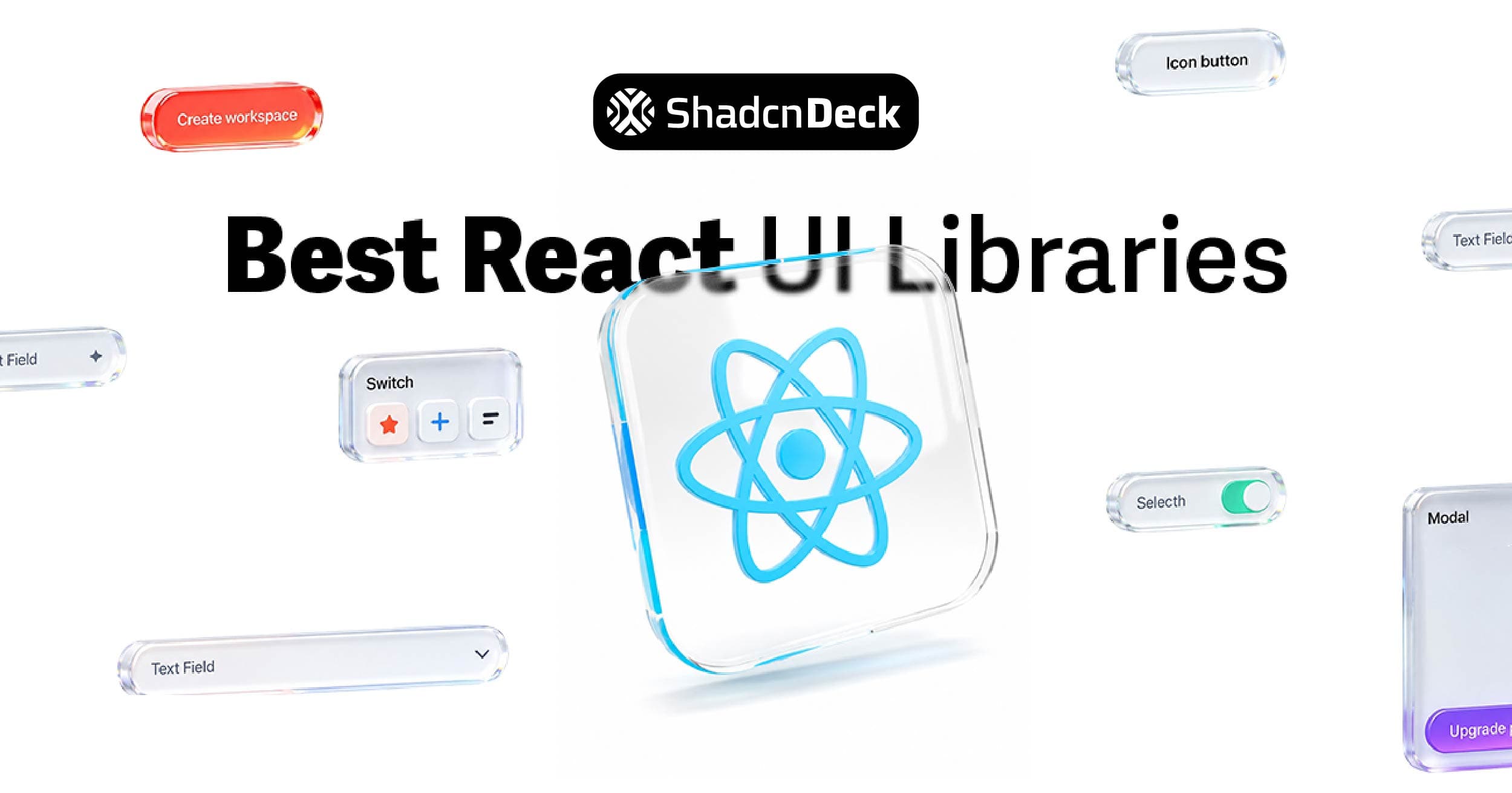
For the bigger picture beyond avatars, see our guide to the best React UI libraries ranked by use case.
But the avatar component is where that flexibility gets interesting. Profile pictures, overlapping team stacks, animated group layouts, status indicators. Avatars show up everywhere: dashboards, chats, comment sections, CRMs. And the shadcn ecosystem has grown around them fast.
Today there isn't one version of the shadcn avatar component. There are dozens: forks, ports, and extended variants across React, Vue, and Figma. Below are 12 of the best, with honest notes on what each one actually does well and who should use it.
What Is the shadcn Avatar Component?
The shadcn Avatar is a lightweight, customizable component for displaying user profile images. Pair it with initials, fallback states, or status indicators and it covers most UI needs out of the box.
It's built on Radix UI primitives, which handles accessibility and structure. Tailwind handles styling, so tweaking borders, shapes, and sizes doesn't require writing custom CSS.
Install it with:
Small footprint. Big flexibility. It scales from single-user profiles to overlapping team stacks without configuration overhead.
📖 Want a deep dive into all avatar patterns? The Shadcn Avatar Component Guide covers status badges, avatar groups, fallback handling, and custom sizing with full code examples.
Where Avatars Show Up in Real Products
- User profiles: account owners, contributors, team leads
- Comment sections: small circular avatars paired with messages
- Team lists: overlapping avatars showing group composition
- Status indicators: online/offline badges combined with profile images
- Editable avatars: upload and preview flows for profile images
If your product involves people, it needs avatars. The component you pick shapes how maintainable that experience stays at scale.
Quick Comparison
| Library | Type | Stack | Pricing | Best For |
|---|---|---|---|---|
| shadcn/ui | Official | React, Radix, Tailwind | Free | Everything |
| Myna UI | Group-focused | React, Radix, Tailwind | Freemium | Team layouts |
| shadcn-vue | Vue port | Vue 3, Radix-Vue, Tailwind | Free | Vue projects |
| shadcnui-blocks | Block library | React, Tailwind | Freemium | Rapid prototyping |
| shadcndesign | Figma kit | Figma | Paid | Design handoff |
| Kibo UI | Avatar Stack | React, Tailwind | Free | Overflow groups |
| Magic UI | Avatar Circles | React, Tailwind | Freemium | Social/marketing UIs |
| ShadCraft | Figma + React | Figma, React | Paid | Full design system |
| Modern UI | Flexible | React, Tailwind, TS | Free | Lightweight projects |
| SHSF UI | Motion-first | React, Framer Motion | Free (beta) | Animated interfaces |
| Animate UI | Motion groups | React, Framer Motion | Freemium | Collaboration UIs |
| Hero UI | Feature-rich | React, Tailwind, TS | Freemium | Production SaaS |
1. shadcn/ui Avatar: The Official Component
Who it's for: Any React or Next.js project using the shadcn/ui stack.
The official shadcn avatar component is the right starting point for most projects. It's production-ready, TypeScript-first, and built on Radix UI primitives. Image fallbacks, whether initials or placeholder icons, work automatically when images fail to load.
No dependency bloat. Composable with other shadcn/ui components: badges, tooltips for avatar hover states, and card layouts with avatar headers. If you need more than the base component offers, it's the cleanest foundation to extend.
Pricing: Free, MIT licensed.
2. Myna UI: Avatar Groups
Who it's for: Dashboards and team views that need stacked avatars out of the box.
Myna UI is a React component library built on Tailwind, Radix UI, and the shadcn/ui aesthetic. Its Avatar Groups component stacks multiple avatars with clean spacing, rounded edges, and overflow indicators like "+3". The design stays consistent with shadcn's visual language.
Install via CLI and it works directly alongside shadcn/ui imports. No configuration conflicts.
Pricing: Freemium. Core components are free, advanced templates via Pro plan.
3. shadcn-vue: Vue 3 Port
Who it's for: Vue developers who want the shadcn avatar experience without switching frameworks.
shadcn-vue is a direct Vue 3 port of the official shadcn/ui avatar. Built with Tailwind CSS, TypeScript, and Radix-Vue, it mirrors the React version closely: circular profile images, fallback initials, responsive sizing.
If your stack is Vue-based, whether for SaaS tools or internal dashboards, this gives you the same developer experience without porting components manually.
Pricing: Free, MIT licensed.
4. shadcnui-blocks: Avatar Blocks
Who it's for: Developers who want pre-composed avatar layouts, not just base components.
shadcnui-blocks ships avatar components already combined with labels, statuses, tooltips, and stacked group layouts. You drop in the block, not the building blocks. The styling aligns with the official shadcn avatar and uses the same Tailwind utilities, so customization is straightforward.
Useful for user lists, comment sections, and team sections where you'd otherwise write the same wrapper logic on every project.
Pricing: Freemium. Limited blocks free, full set via one-time payment.
5. shadcndesign: Figma Kit
Who it's for: Design-to-development teams who need tight Figma-to-code fidelity.
shadcndesign is a premium Figma kit built around the shadcn/ui design system. The avatar component supports multiple sizes (24px, 32px, 40px, 64px), circular and rounded shapes, status indicators, and initials fallbacks. Design tokens align with Tailwind CSS variables, so hand-off to developers using the shadcn avatar component is clean.
Pricing: One-time payment, 14-day refund policy.
6. Kibo UI: Avatar Stack
Who it's for: Projects that need overlapping avatar groups with overflow handling.
Kibo UI's Avatar Stack extends the shadcn avatar with stacking and overflow logic. Show "+3 more" with a clean count indicator. Styled with Tailwind and compatible with shadcn/ui variables, so it drops into existing projects without styling conflicts.
Ideal for collaborative interfaces such as task boards, shared documents, and project member lists.
Pricing: Free, MIT licensed.
7. Magic UI: Avatar Circles
Who it's for: Marketing pages and social UIs that need a polished group avatar component fast.
Magic UI's Avatar Circles renders multiple circular avatars side by side, overlapping, with a "+X more" count once you hit overflow. The visual is playful but clean, and works well in hero sections, social proof blocks, and collaboration indicators.
Compatible with shadcn-style avatar components, so it mixes into your existing UI system without visual inconsistency.
Pricing: Freemium. Basic component free, Pro version at $199 one-time for advanced components and templates.
8. ShadCraft: Figma + React Kit
Who it's for: Teams running a full design system across Figma and React.
ShadCraft mirrors the shadcn/ui design system across both Figma and React with 200+ components. The avatar component covers all states: image, initials fallback, status badges, multiple sizes. Light and dark theme support is built in, and design tokens align with Tailwind variables.
The Avatar Stack variant also ships with the kit, with horizontal or vertical stacking, configurable overlap, and overflow count, usable in both Figma and React.
Pricing: One-time payment. Base kit at $119, Pro at $299.
9. Modern UI: Lightweight Avatar
Who it's for: Developers who want shape flexibility without adding motion overhead.
Modern UI's avatar component supports circular, rounded, and square shapes. Built-in fallback handles broken image URLs gracefully. Tailwind-based, TypeScript-ready, and minimal in footprint.
Works well as a standalone component if you're not using a full component library and need something that extends naturally into dashboards, chat lists, or comment threads.
Pricing: Free, open source.
10. SHSF UI: Motion-Rich Avatar
Who it's for: Interfaces that need animated avatar states without building animations from scratch.
SHSF UI builds on React, TypeScript, Tailwind, and Framer Motion. Avatars transition smoothly between image, initials, and badge states. Group layouts feel layered and dynamic compared to static alternatives.
Useful for social tools, creative dashboards, or any interface where user presence needs to feel active rather than decorative. Currently in beta.
Pricing: Free, beta, community support on GitHub.
11. Animate UI: Avatar Group with Spring Animations
Who it's for: Collaborative SaaS products where user presence is a UI feature, not a UI detail.
Animate UI's Avatar Group arranges overlapping user avatars in a horizontal line. Hovering triggers spring-based depth effects and forward shifts via Framer Motion. The result reads as polished without feeling heavy.
Customizable motion options including stiffness, damping, and delays, so you can tone down or amplify the animation to match your product's feel. Aligns with shadcn avatar component patterns for easy integration.
Pricing: Freemium. Core AvatarGroup free, advanced animation packs in Pro.
12. Hero UI: Feature-Rich Avatar
Who it's for: Production SaaS apps that need a broad component set with avatar handling built in.
Hero UI ships a robust avatar component with circular and rounded shapes, fallback initials, status badges, and group stacking with overflow count indicators. It's part of a large-scale component library with buttons, modals, dropdowns, and tables, so if you need more than just avatars, it covers the surrounding ecosystem too. To see how shadcn avatar compares to MUI's approach, we broke down the design philosophy differences in a separate post.
TypeScript-ready, accessible by default, compatible with React and Next.js App Router.
Pricing: Freemium. Core components MIT licensed, Pro for extended themes and enterprise features.
How to Pick the Right One
Starting a new React project: Use the official shadcn/ui avatar component. Add Kibo UI's Avatar Stack when you need group layouts.
Need overlapping team avatars fast: Myna UI or Magic UI. Both drop in without configuration work.
Vue project: shadcn-vue. No other option matches the shadcn design language for Vue.
Design team needs Figma parity: shadcndesign or ShadCraft, depending on whether you also need the React component or just the Figma kit.
Animated interfaces: Animate UI for group animations, SHSF UI for individual avatar state transitions.
Full component library alongside avatars: Hero UI if you need breadth, Myna UI if you want to stay closer to the shadcn/ui aesthetic. Whichever you pick, you'll likely need button components to pair with avatars for profile actions and user menus.
🖼️ Building a SaaS with team collaboration features? The free shadcn templates include pre-built layouts with avatar groups and user presence patterns already in place.
The Bottom Line
The shadcn avatar ecosystem covers more ground than most developers realise. The official component handles the majority of use cases. When it doesn't, the extensions above are close enough in design language that mixing them into a shadcn/ui project rarely creates visual inconsistencies.
Start with the base. Add what your product needs.
Explore more shadcn/ui component guides:
- Shadcn Avatar Component Guide - Status badges, avatar groups, fallback handling, and custom sizing
- Shadcn Accordion Component Guide - Build collapsible FAQ sections and navigation with 12+ variants
- Shadcn Tabs Component Guide - Build tabbed interfaces with 12+ variants and animations
- Shadcn Chat UI Guide - Build modern chat interfaces with message bubbles and typing indicators
- Shadcn Resizable Sidebar Guide - Build collapsible and resizable layouts for dashboards
- Free Shadcn Templates - 15 production-ready shadcn/ui templates for landing pages and SaaS apps
- Shadcn Card Component Guide - Embed avatars in card components for user profiles and team sections
- Shadcn Button Examples - Button variants that pair with avatar-based profile actions
- Shadcn vs Material UI - Compare component design philosophies including avatar implementations
- Shadcn Tooltip Component Guide - Add hover tooltips to avatar components for user info display
