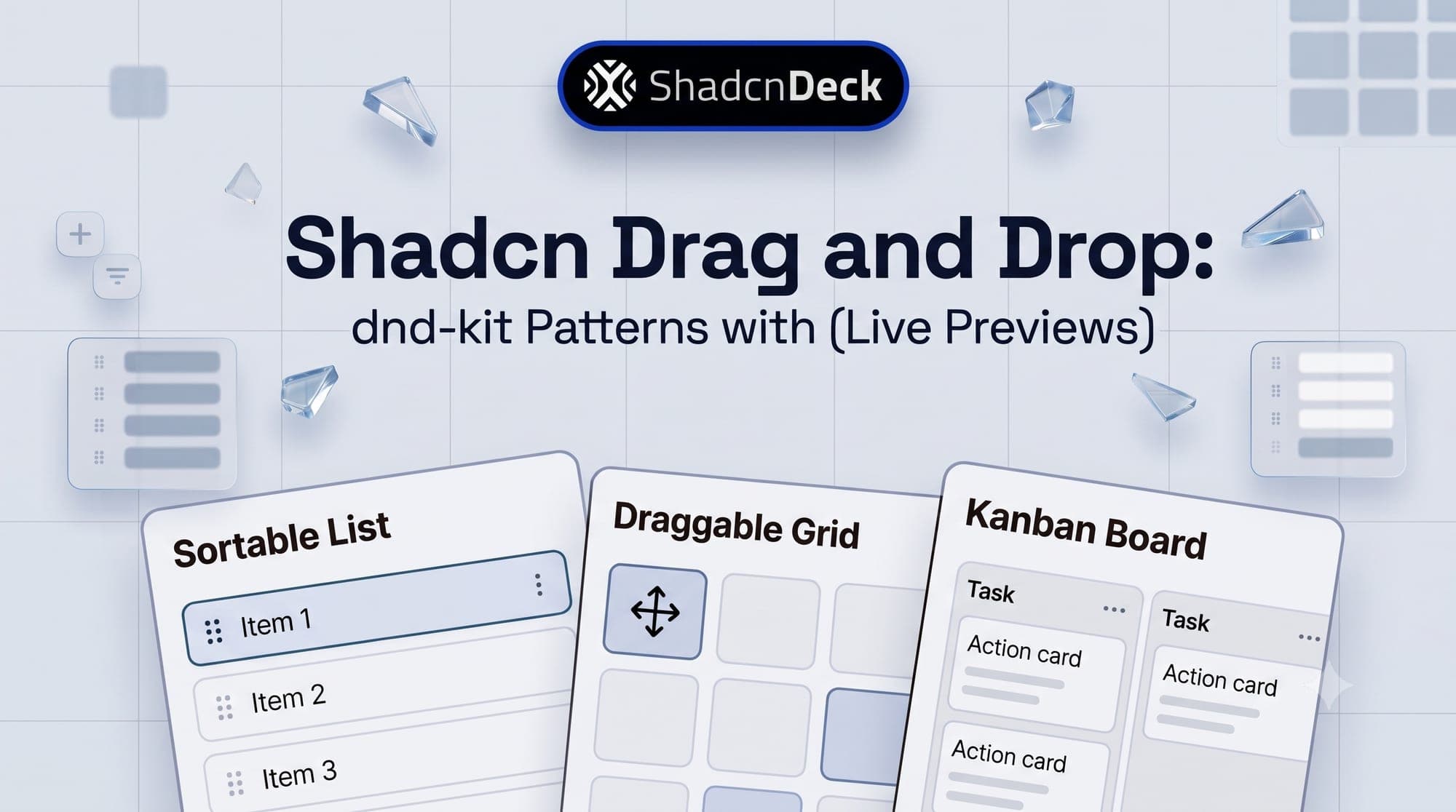
shadcn drag and drop means pairing shadcn/ui components with dnd-kit, because shadcn/ui ships no drag-and-drop primitive of its own. Every sortable list, kanban board, and draggable table row runs on dnd-kit's DndContext and SortableContext providers wrapped around markup the shadcn CLI already gave you.
Drag behaviour is a layer, not a component, which is why it is worth knowing which shadcn primitives you are layering it onto before you start.
This guide covers 4 patterns, each with a live preview you can actually drag and the full code underneath: sortable list, kanban board, file upload zone, and draggable data table rows.
How does shadcn drag and drop work?
Three building blocks cover almost everything. DndContext tracks the active drag operation and fires onDragStart and onDragEnd. SortableContext wraps a group of items and keeps their order in sync. The useSortable hook attaches drag listeners, transform styles, and ARIA attributes to one individual element.
The important property is that dnd-kit never renders anything. It hands you setNodeRef, listeners, and a transform, and you spread them onto your own markup. It does not care whether that markup is a shadcn Card, a TableRow, or a bare div. Only the markup changes between the four patterns below; the hooks stay identical.
That matters more than it sounds. A library that ships its own list and item components fights your design system the moment you want a different border radius. dnd-kit has nothing to fight with, because your component stays yours.
What do you need to install?
Add the shadcn components you plan to drag first, then the dnd-kit packages. This guide is written against dnd-kit core 6.3.1, sortable 10.0.0, and utilities 3.2.2.
Each package earns its place:
- @dnd-kit/core supplies
DndContext, the sensors, and the collision detection algorithms. - @dnd-kit/sortable adds
SortableContext,useSortable, and thearrayMovehelper every pattern here uses. - @dnd-kit/utilities supplies the
CSShelper that turns a drag transform into an inline style string.
Pattern 4 also needs @tanstack/react-table. Skip it if you only want lists and boards, since nothing else in this guide touches it.
Which drag and drop pattern do you need?
The four patterns differ in one dimension that matters more than the rest: whether an item can move between containers or only within one.
| Pattern | Runs on | Cross-container | Typical use case |
|---|---|---|---|
| 1. Sortable list | core + sortable | No | Playlists, priority queues, checklists |
| 2. Kanban board | core + sortable | Yes | Task boards, pipelines, ticket triage |
| 3. File upload zone | Native HTML5 events | Not applicable | Attachments, media, bulk import |
| 4. Draggable table rows | core + sortable + TanStack Table | No | Manual sort order, admin tables |
Pattern 3 is the odd one out, and deliberately so. dnd-kit reorders elements that are already on the page. It has no concept of a file arriving from the operating system, so an upload zone uses the browser's native drag events instead.
4 shadcn drag and drop patterns with live previews
Every preview below runs the real component. Drag the handles, move cards between columns, drop a file on the upload zone, then open the Code tab to see the file that produced it.
1. Sortable List
A sortable list reorders a single column of shadcn Card components and keeps the new order in state. It is the simplest pattern here and the foundation the other three build on.
Best for: to-do apps, priority queues, and any single-column list where order carries meaning.
Two details do most of the work here. touch-none on the handle stops the browser claiming the gesture as a scroll on mobile, and without it dragging simply will not start on a phone. activationConstraint requires 4 pixels of movement before a drag begins, which is what keeps an ordinary click on the handle from registering as a drag. The card component itself is untouched shadcn output; only the ref, style, and listeners are new.
🎨 Want the dragged state to read more clearly? The opacity and border treatment during a drag are just theme tokens. Preview a palette where the lifted card actually stands out against the list with the free shadcn theme editor.
2. Kanban Board
A kanban board extends the sortable list across several droppable columns, so a card can move within a column and between columns. This is where DragOverlay starts to matter: it renders a floating copy of the card that follows the cursor, so the card never looks like it is fighting its container.
Best for: task boards, support-ticket triage, and any workflow with named stages.
Three choices here are worth copying rather than rediscovering. closestCorners replaces closestCenter, because centre-point detection misjudges targets badly once containers sit side by side. useDroppable on the column is what keeps an empty column droppable at all, since a SortableContext with no items registers no drop targets. And the handleDragEnd above resolves the target column from the card underneath the cursor first, falling back to the column id, which is what makes a drop land correctly whether you release over a card or over empty space.
⚡ Building a whole app shell around this? The ChatDeck SaaS template ships the layout a board like this usually lives inside, so you can spend your time on the drag logic instead of the chrome around it.

3. File Upload Drop Zone
An upload zone reacts to native HTML5 drag events rather than dnd-kit. This is not a workaround. dnd-kit moves elements that already exist in your React tree, and a file dragged in from Finder or Explorer is not one of them, so onDragOver and onDrop on a plain div are the correct tools.
Best for: attachments, media libraries, and bulk-import screens.
Drag files here, or browse to choose them
The event.preventDefault() inside onDragOver is not optional. Leave it out and the browser does its default thing with a dropped file, which is to navigate away from your app and open the file directly. Two smaller points: sr-only rather than hidden on the input keeps it reachable for screen readers, and Button asChild wrapping a label gives you button styling on an element that can still trigger the file picker. That asChild composition trick turns up constantly once you notice it.
A drop zone like this most often ends up attached to a message composer, which is the same place attachment previews and upload states have to be designed.
4. Draggable Data Table Rows
A draggable table combines TanStack Table's headless row model with useSortable on each TableRow. The grip lives in its own narrow column so the rest of each row stays clickable, which is what you want the moment rows link somewhere.
Best for: manual sort order on products, playlist tracks, or any admin table where drag position is the source of truth.
| Product | Price | |
|---|---|---|
| ChatDeck SaaS Landing | $49 | |
| Portfolio Starter | $29 | |
| Docs Site Template | $39 | |
| Admin Dashboard Kit | $59 |
getRowId is the line people skip and then spend an afternoon debugging. Without it TanStack Table falls back to array indexes for row ids, so after the first drag the id of a row no longer matches the item it started on and every subsequent drop lands somewhere unexpected. Point it at a database id and the problem disappears.
This pattern deliberately enables only getCoreRowModel. Once the table also needs sorting, search, or pagination, the additions are the ones covered in the full data table guide. One honest caveat for 2026: column sorting and drag-to-reorder are contradictory ideas, since a user-sorted column has already decided the order. Offer manual reordering only while the table sits in its unsorted state, or disable the grip when a sort is active.
Is drag and drop the same as drag-to-resize?
No, and they use different libraries. Drag and drop moves an element from one position to another, which is dnd-kit's job. Drag-to-resize changes how much space a panel occupies without moving anything, which is what react-resizable-panels handles through the shadcn Resizable component.
The distinction matters when you are picking a dependency. Reaching for dnd-kit to build a split-pane layout means writing pointer maths that another library already solved, and reaching for resizable panels to build a kanban board does not work at all. The resizable sidebar patterns cover that other half, and a dashboard often ends up with both: a resizable shell around a board whose cards drag.
Is dnd-kit accessible by default?
Largely, and more so than most alternatives. Register the KeyboardSensor and any keyboard user can focus a handle, press Space to lift the item, move it with the arrow keys, and press Space again to drop it. DndContext announces the start, the movement, and the drop through a built-in live region, so a screen reader user hears the reorder happen. Three habits keep that intact:
- Render the handle as a real button. A
divcarrying onlyonPointerDowntakes no keyboard focus, which silently removes the entire keyboard path. Every handle above is a<button type="button">. - Give each handle a specific aria-label. An interpolated label such as
Reorder Review pull request #482tells a screen reader which item is about to move. A shared label of "drag" across ten rows tells it nothing. - Prefer a dedicated handle over a fully draggable row. Pattern 2 spreads listeners across the whole card because a board card has nothing else to click, but on a table row or a list item with links, a full-surface drag steals the click and tap targets from everyone.
The honest limitation: dnd-kit gives you the mechanics, not the wording. The default announcements are generic ("Draggable item 2 was moved"), and improving them means passing your own accessibility.announcements strings to DndContext. Most projects never do, which is a small, quiet accessibility debt worth paying down. The same underlying question, how much a primitive gives you before you have to write ARIA yourself, is what the Radix and Base UI comparison digs into for the rest of the component set.
Which pattern should you build?
Start with the sortable list even if you eventually need a board. It is the same three hooks with one container instead of several, and getting the sensors, the handle, and the state update right on a single column takes most of the difficulty out of the kanban version.
Only reach for the kanban pattern when items genuinely change category by moving, not merely position. If your columns are just filtered views of one list, a filter control is a better answer than a board. For files, never reach for dnd-kit at all. And for tables, add drag last, after you know whether sorting is also on the table's requirements list, because those two features have to be reconciled rather than stacked.
If the interaction is a small part of a larger build, ShadcnDeck's shadcn/ui templates give you a themed, production-shaped project to drop these patterns into, and the free tier is enough to see how the pieces fit before you commit.
For the full API, see the dnd-kit documentation and TanStack Table's own row drag-and-drop example.

Related Posts
More interaction-heavy shadcn patterns:
- shadcn data table guide - add sorting, search, and pagination to the table from Pattern 4
- shadcn resizable sidebar guide - drag-to-resize, the other drag interaction
- shadcn card component guide - the component doing the dragging in Patterns 1 and 2
- shadcn chat UI guide - where a file drop zone usually ends up living
- open source shadcn/ui projects worth studying - including a drag-and-drop form builder
- shadcn component libraries - libraries shipping kanban and Gantt components already built
- Radix vs Base UI - what the primitives underneath give you for free
- shadcn components directory